No products in the cart.
Teaching Rocinante to Dance
A design exploration that led to Havelock's expansion
The process of connecting Rocinante Titling to last year’s Havelock Titling was a weird one, for sure. I’m not sure why I ever intuited that the idea should expand, but something in the modularity in Havelock’s concept made me sure that there was something to look for. More Havelock, maybe? But not exactly Havelock.

This sketch was the first time I’d considered that Havelock could be more than a single family of typefaces.
I began knowing that I wanted to expand the family into several connected-but-not-identical families shortly after Havelock’s release—but I wasn’t sure how to do that, because it wasn’t clear about which part of Havelock’s DNA would fit in other contexts. I was fairly sure it was the family’s simple strokes and machine references, but I wasn’t positive—so I devised a scenario in which to explore.
I started by looking for ways to make contrast in form. Squares against rounds felt right at the beginning. From that, I drew quick, essential forms set along Havelock’s five weights, then added a width matrix to see where it felt most rhythmic. The exercise was twenty-five faces total, Light Extra-Condensed to Black Extra-Wide.


Squares and wide rectangles in the same weights were interesting, but not right—I’ve never seen a squared typeface that seemed graceful. That complete lack of grace proved that Havelock’s full-spectrum shape vocabulary was the key to describing a graceful monoline. Grace was an essential point of emphasis between the two faces.
Also, while looking at the squares, I noted that I was completely repelled by the retro-deco sci-fi-ness that squares emphasized. I wanted something more modern, more humane. An Expanse, not a 2001. More about people using technology to find humanity, not about people fighting technology to retain humanity.
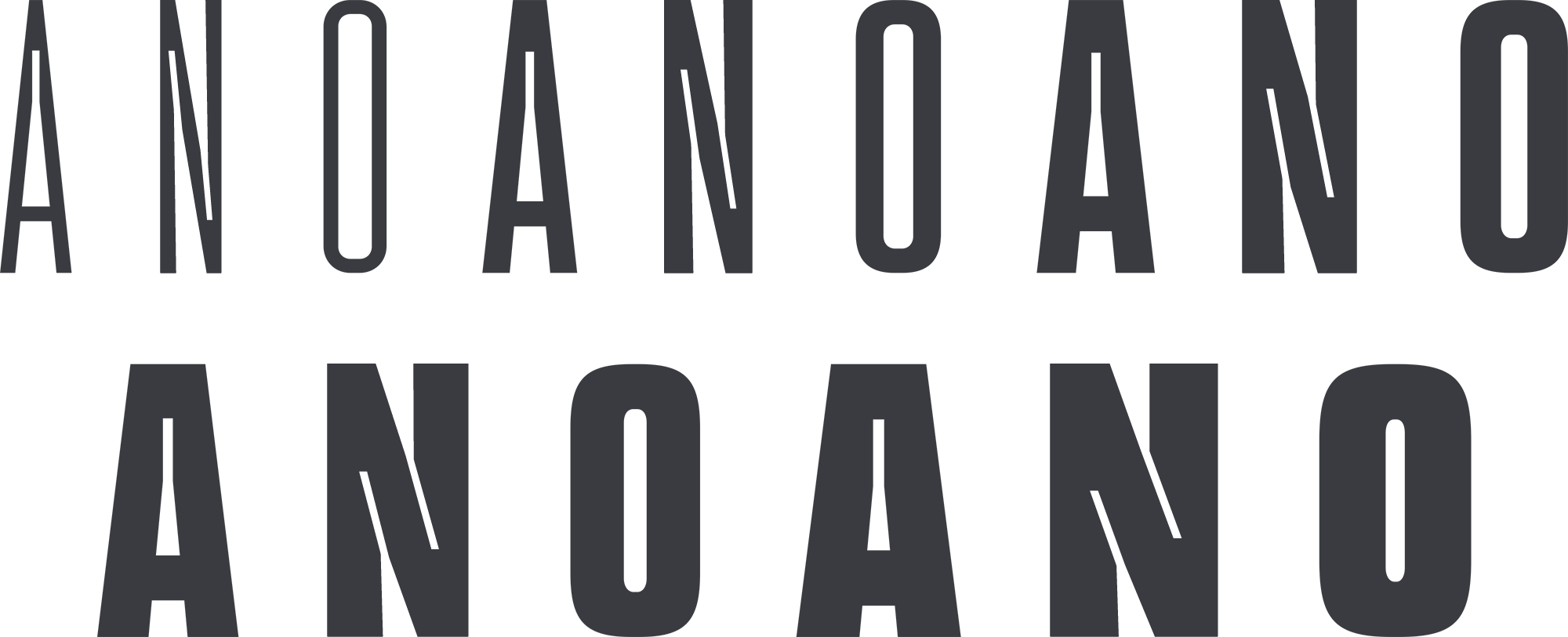
A Havelock partner needed more than weight to feel connected—it needed a visual dance. Looking at Havelock’s geometry, that dance is easy to see by tracking the motion of characters, from terminus to terminus—it’s pretty clear that the forms’ motion is derived from signpainting and then rendered mechanically.

So, in a bid for both motion and grace, I dumped the family’s medium-to-wide widths entirely to focus on the narrow forms and see what that might yield. What ho: pay dirt! A tall, compressed, tense form carried Havelock’s sense of authoritative presence, yet had a very different movement.
Around the same time, I was also interested in manipulating a letter’s interior shapes, especially in challenging characters—looking at the amount of stroke I could could remove without sacrificing rhythm. I began carving into the interiors to let more light in and create more motion. And also, around that point, I named the family Rocinante.
A mechanical lightwell, made larger than function dictated, gave the motion and a tensely-wound interior that became even more interesting in bold forms. The size and scale of the lightwell declared it a design detail, and not just a technical correction. I liked the idea of taking that optical correction from necessity to flourish because that is a defining characteristic in how culture gets made. Find a limitation, work within it, and make subtle alterations, which get passed around like-minded groups.
Rocinante’s lightwells and compressed strokes combined with its generous curves felt like a beautiful way to expand Havelock’s initial idea: machined and human-drawn forms existing in harmony, not absolutist binary. We know nowadays that machines only work well if they reflect the humane well.
In Rocinante, the combination of machined and written became an ongoing theme, especially in characters needing a pared-down construction. Here’s the design steps that yielded the German eszett.

The first iteration feels too calligraphic and handmade to feel connected to the modernness of the rest of the face. Technically it works, but it feels so… fusty. Old-fashioned.
The second iteration is closer; it feels more modern—but the top is still too round, too much like a handwritten cursive.
The next two iterations are much closer, but the connections and transitions still needed work.
And finally, a form I liked. It has a lyricism to it—a nice rounded entry at the top, a sudden zig-zag down, gentle curves into the final terminus. It feels like the way a hand would make the form, but uses a mechanical precision to get there.
And here are the steps for the pound sterling.
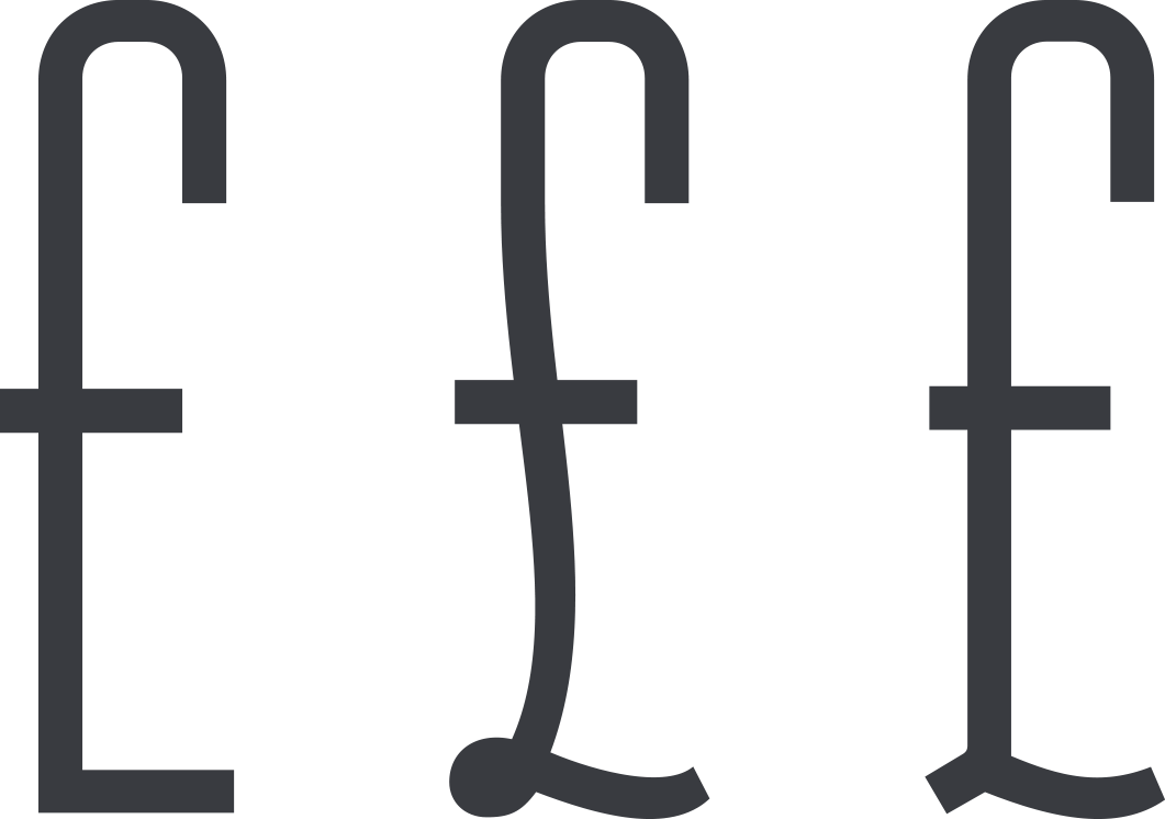
First step is too obviously mechanical, not human enough. It looks a bit unsympathetically hacked-from-the-grid. (It was, I was super tired when I started this.)
Second step is closer, but veers too far into the calligraphic. The third step is where I realized that this form’s key is the abstraction of the lower loop away from the pen-drawn. In the final form, you can see how that abstraction works: the handwritten motion is clearly present in that tiny curve, but the loop’s bulge merges with the machined stroke.
Finally, I added more forms that related to these shapes: a 6 and 9 with strokes that reflect a background in signpainting, a 3 with a contrasting hard top to its round bottom, a question mark with a gently-tapered bottom stroke reflecting a pen, curvy brackets that are nearly calligraphic.

Rocinante sets nicely down to about 20 pixels on the screen thanks to its generous lightwells. It creates a rhythmic and regal block of widely-spaced words in text, and can add a nice sense of pattern and craft to interface elements. Set larger, it gives enough visual interest to be the solid base for a logotype, and without much fiddling afterwards.
This concept of connected type families will continue as time goes on, with more kinds of letters in the same spirit and weights. Eventually, I hope to create a sort of digital allsorts tray—many different ideas that the designer can combine for surprising typographic options. I like the humanity present in that choice, the sense that aesthetic decisions can combine many harmonious voices into a single composition—and with no wrong answers.
But for now, please enjoy Rocinante on its own, and in combination with Havelock. Their voices will grow as the collection grows.
If you’d like to hear about new collections as they’re released, please add yourself to the mailing list. Those folks get first stab at new work, and with discounts as a thank you for their interest.