No products in the cart.
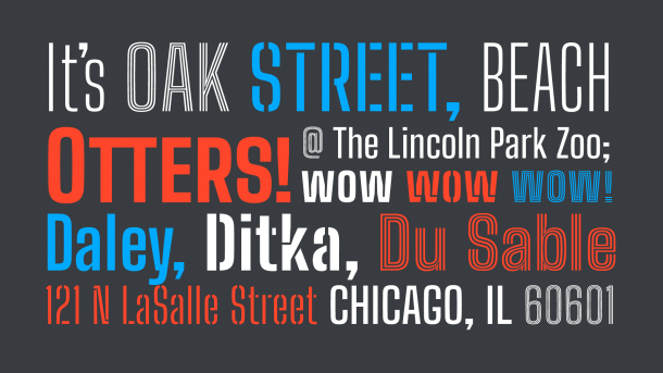
Building Big Shoulders
How Big Shoulders came to be Chicago's official typeface
In late summer of 2018, Ogilvy, whom I work with on a regular basis but hadn’t heard from in six months, invited me to lunch. No agenda specified. The hair on the back of my neck immediately went up.
“WHY.” I demanded.
“You’ll see,” Gabe Usadel, who’s the Ogilvy 485 Creative Director, told me. I could hear him grinning through the phone, and then the dude just straight up hung up on me. The audacity, the nerve.
A few days later, Gabe, Tereasa Surratt (who’s a longtime friend and VP Global Group Creative Director at Ogilvy), and I gathered. Gabe was grinning wide enough to drive a truck through, but still refusing to give up a single detail.
Someone I hadn’t met before appeared, a little out of breath from running to make the meeting. Real big guy, strong mustache game, kind of seemed like a soccer player? You know the kind: intense, optimistic, kinetic.
Jason Kunesh, who’s the City of Chicago’s Design Director, hastily sat, and stuffed his backpack under the table. And finally, Gabe eyed Jason for clearance to begin. Jason nodded, and Gabe took a deep breath.
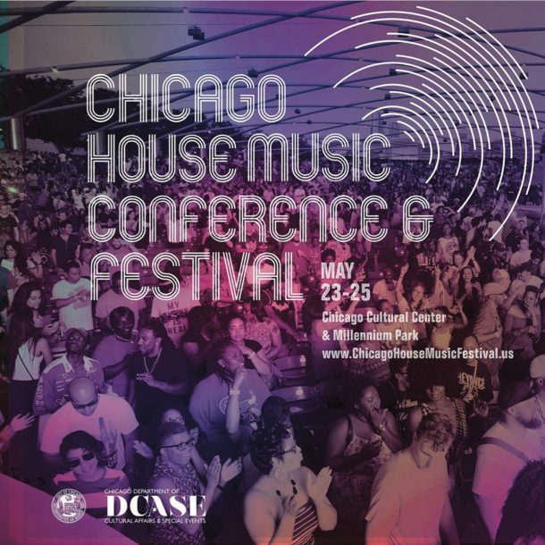
“Okay, here’s what’s up,” he said. “We’re creating a new design system for Chicago, a hybrid branding project and community identity. We’re gonna give Chicago a unified voice, from the government all the way down to the Chicago House Music Festival. We have some typographic ideas we’ve been working with, but nothing that’s coming out right.
“We need you to make the type for it, as a partner to Ogilvy. We’re not commissioning you; we want to partner with you. The city doesn’t have a design budget set aside for this kind of thing, so that means we’re doing this citizen-led. We each need to figure out funding on our own. This is an equal bet for both our companies.”
“Jason has some specific ideas about the community aspect of the project, and we thought you were the person to make those happen.” Gabe turned to Jason.
“I want both the Chicago Design System and this typeface to be an expression of Chicago as a cultural collective,” Jason said.
“I want it to be about the people who come to be here from all around the world. I want it to be about our history, but I really want it to be about who we are now, in all our races, birth nationalities, genders, sexualities, and abilities. It has to be one hundred percent free to the public, and open-source. It has to be free of ownership, it has to be available for everyone to use however they want, and your font has to be on Google Fonts so everyone can get to it as easily as possible.”
(I think at this point I stuffed food in my mouth, because I had so many questions.)
“I want the Chicago Design System to be something every person in Chicago can call their own, and use in whatever way they see fit. Chicago is for all of us, and so the Design System should be too.”
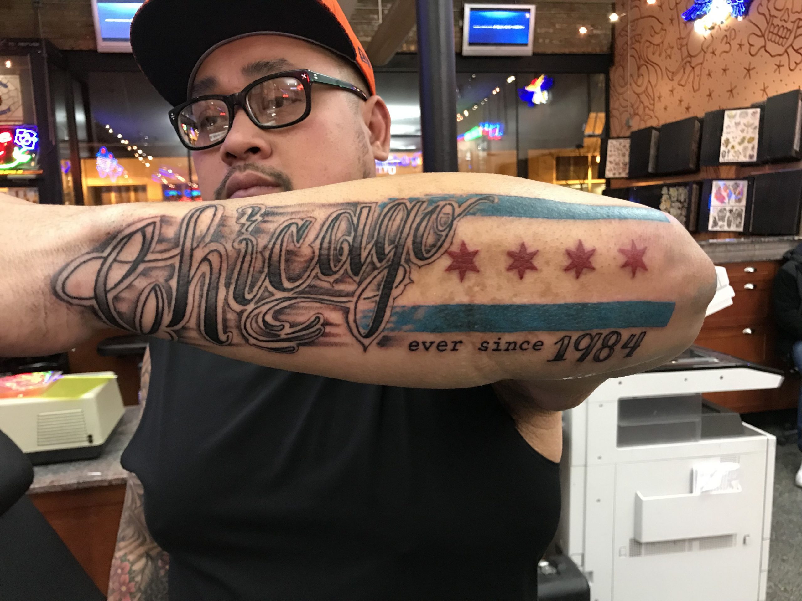
“Also, there has to be a Chicago Star in the font, because nobody ever knows how to draw that thing right, and there are a lot of tattoos out there. Some might need their stars fixed.” Chicago’s percentage of citizens with city flag tattoos is rivaled only by the number of people in Washington D.C. who sport their own.
“And,” Tereasa interjected with raised finger, “it has to be called Big Shoulders.”
I had no problem with calling it Big Shoulders. Obviously I said yes, I’d love to do it, thank you for the opportunity. We had lunch. It was delicious. I remember literally nothing about the El ride back home.
The Cow Didn’t Do It
A few things about Chicago.
It is a city defined by near-constant transformation.
Chicago began as a tiny shipping outpost, founded by Jean Baptiste Point du Sable, a free black man working as a trader, somewhere around the 1780s. Du Sable is a mysterious dude without much documented past. He’s sometimes described as a biracial African/French-Canadian man, sometimes Haitian.
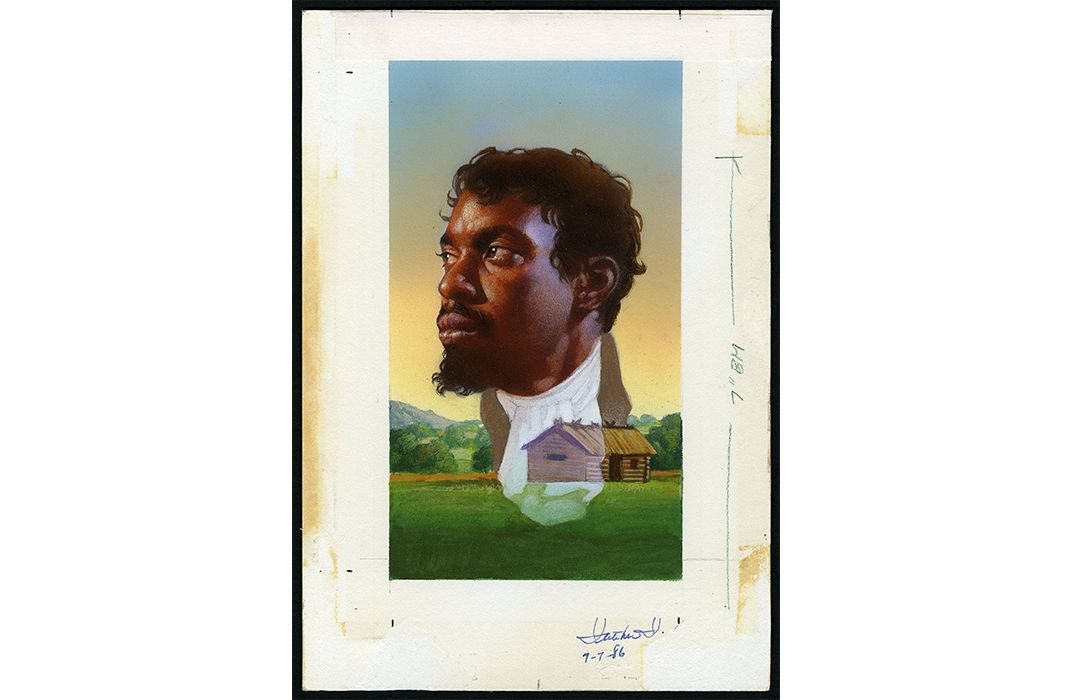
Jean Baptiste Point du Sable, as painted by Thomas Blackshear II, for the USPS in 1987.
We do know he built relationships with nearby communities and traders, involving his family, to establish the area as a shipping hub.
In 1800, du Sable sold the Chicago River property to interested parties, including the relationships he’d laid out, and then left to retire in the Missouri River Valley region, more than likely because he was annoyed that the United States government wanted him to buy the land he’d lived on for decades. Relatable.
The area was largely French in culture at that point, and called Eschecagou, which is Potawatomi for “land of the wild onions” rendered through whatever mechanism operated as Google Translate French back then. That name was later shortened to Checagou, and finally anglicized to Chicago.
In the 1800s, Chicago grew rapidly into a manufacturing and shipping center due to its proximity to Lake Michigan, the Chicago River’s connection to the Mississippi River, and ultimately the Gulf of Mexico.
In a spectacular whoopsie of unregulated industrial waste disposal, the city got itself basically leveled by a two-day fire in 1871, which destroyed about four square miles of property and a third of the city’s valuation, and also gave rise to the local legend of Mrs. O’Leary’s cow, who knocked over a lantern to begin the fire (not true, let the cow be).
That wake-up call gave Chicago’s government a unique opportunity to wipe the slate clean and start over with a new city plan and a new respect for careful civic thought, thus setting a precedent for the careful way we consider everything we build now. Daniel Burnham was commissioned to re-map and re-plan the city in 1909, wood structures were outlawed downtown (giving rise to the modern skyscraper), and we now oversee waste management like you wouldn’t believe.
Beginning in the 1990s, after a rough patch in the 1970s and ’80s, Chicago began transitioning from an industrial-age large-scale manufacturing and livestock city to a boutique-manufacturing and information management center with deep roots in Internet culture. That’s where we are now.
Type for a Place
How do I build a typographic portrait of a city that keeps changing?
By my thinking, there are three vital components to making a place transform into A Place: location, history, and culture.
These overlap: a good place brings people, reliable people build history, place and history help people build culture. Culture reinforces history, bringing more people to The Place, and boom: a city happens.
The character of these typefaces had to speak about all these intersections, equally. Place, History, and Culture became my base themes to fill in.
I chose three visual devices to overlay onto those: letters made for work, letters made for protest, and letters made for celebration.
I knew that a single weight (which was really all we’d been talking about up to that point) wouldn’t be enough. Chicago’s histories are too complex to build a single visual story from. So that meant a series of weights, allowing me to transform tone across the family.
Secondly, for Big Shoulders to be usable by both designers and non-designers alike, the program had to be easy to understand. It needed to be a family of three thematically-connected ideas, in a number of weights, that anyone could find use for. So there we were.
Letters for Work
The first letterforms I’d call Chicagoan were on signs used as railroad waymarkers, beginning in the mid-1800s. They were tall, compact, sometimes crudely-painted letters on board, things made entirely to pack space and point the way, so a train wouldn’t end up in the wrong town. These signs were conceptualized by probably-harried signpainters and metalcasters working to get things moving, quickly.
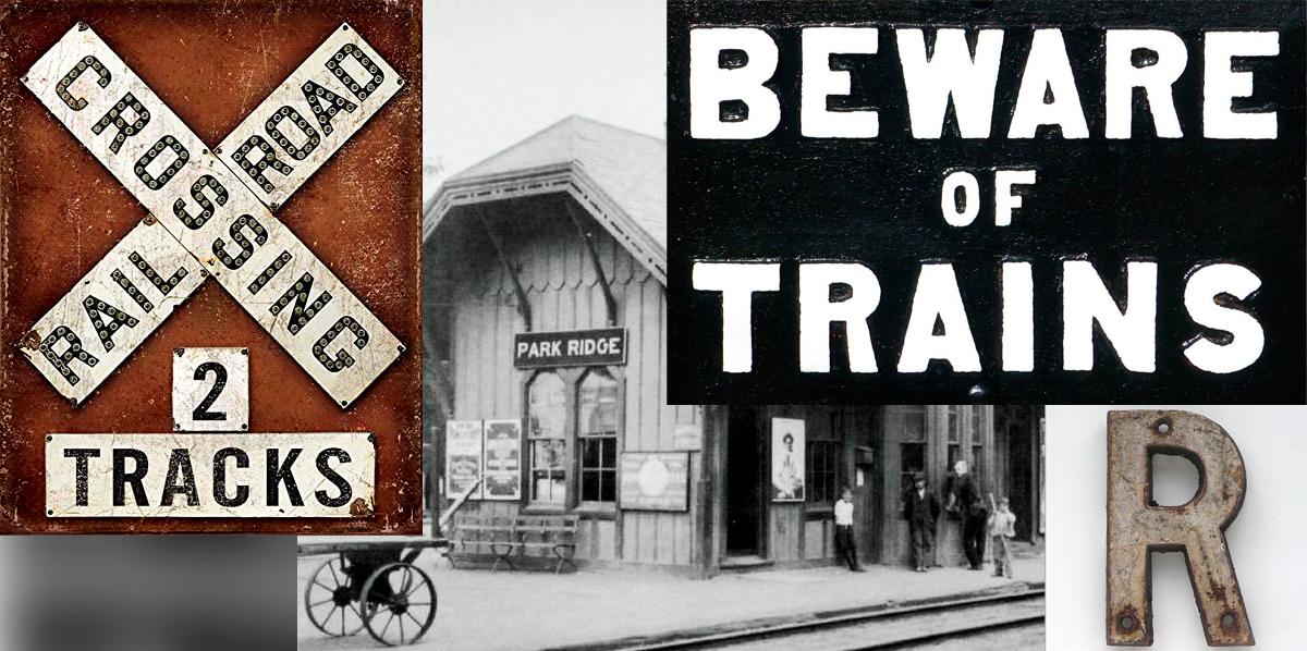
There are remnants of this “shut up with your fancymaking and get the job done” mindset embedded in Chicago’s visual sensibilities. Sometimes it’s an overall economy of form, sometimes it’s a stubborn refusal to consider form beyond purpose. Chicago’s visual things are usually no-nonsense, but some also astound with their spectacular weirdness.
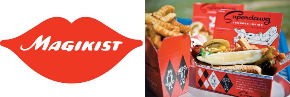
The Magikist lips towered for years over the interstate; Superdawg is a much-beloved Chicago dog spot.
I knew I wanted Big Shoulders’ voice to have range: to be graceful, leggy, and spacious at its thinnest, bulky and imposing at its heaviest. I wanted light weights to feel like Chicago’s skyline as seen from the air: tall, with lots of room for the eye to move. At its heaviest, I wanted it to feel like the physical security of downtown, where you’re constantly aware of the imposing bulk of the towers around you. I wanted its widths to be a little weird, calling back to that railway lettering getting things done as best it could, and also the city’s refusal to make something pretty every time it’s expected to.
I pulled specimens of finished types referring to railway lettering as a starting point, like ATF’s Railroad Gothic (1902), Benton’s Alternate Gothic (1903), and Inland Condensed Title Gothic No. 11 (1905), to find stout, mostly-neutral-but-also-odd shapes. I liked Railroad Gothic’s stoutness, Alternate Gothic’s sense of packing space, and the Inland’s slightly-weird geometry. So those became my starting points for the underlying geometry.
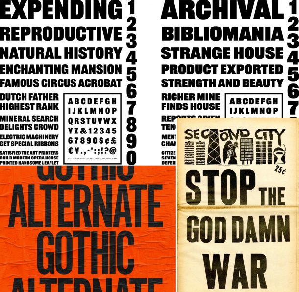
Top: ATF’s Railroad Gothic (1902). Bottom: Benton’s Alternate Gothic (1903), and Inland Condensed Title Gothic No. 11 (1905).
My initial studies were kinda all over the map, but I finally decided I wanted a fairly neutral tone in a Gothic sans, with a sense of visual packing and density. I gave the round shapes’ vertical strokes a slight outward curve to give warmth, and a flattened bowl that lends gravity.
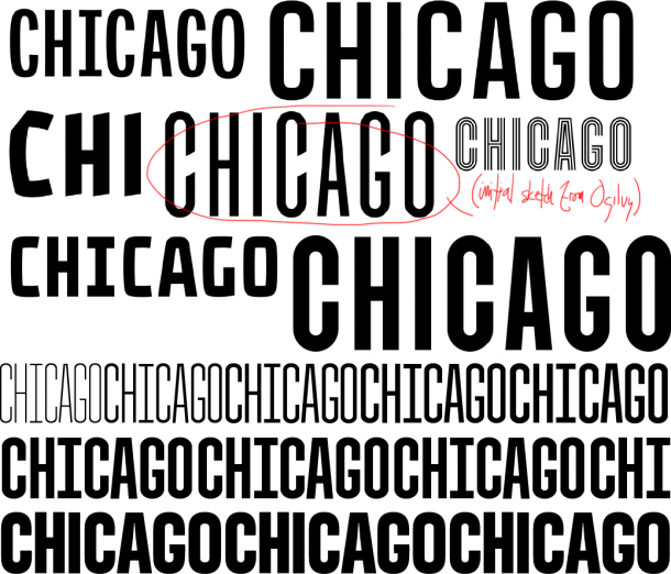
A whole lot of nope, mostly to prove that a simple undecorated Gothic was the best idea for a typeface that was usable beyond a logo.
Big Shoulders’ weight progression is an act of physical compression—a stroke that compresses and crushes itself. I visibly smashed and compressed folded strokes as they changed from Thin to Black. Thin A is a delicate monostroke trestle, but Black A is a pair of skyscraper girders with a tense channel of space running between them.
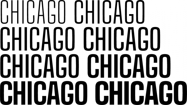
The final weight progression includes 8 weights, Thin to Black.
The Citizen Toolkit: Letters Everyone Can Use
Another major aspect to consider for the suite’s rationale was the Chicago Design System’s usability as a citizen design toolkit—one that anyone could figure out easily. We had to create the typefaces in a way that folks with a rudimentary understanding of type would be able to use it, and feel confident that they knew what they were doing. Nothing overdesigned, nothing requiring ligatures to work well, and ligatures only as a design flourish, but not absolutely necessary to work.
The Chicago Design System itself only uses a couple of Big Shoulders’ weights, which gave me a lot of leeway to develop decorative ideas.
To that end, I chose a series of decorative forms with immediately recognizable purposes within the city: a stencil and a multi-line.

Big Shoulders, Big Shoulders Stencil, and Big Shoulders Inline ExtraBold
Stencils show up in decades’ worth of protest signs, on shipping containers, and in hastily-made construction signs (Chicago is literally always under construction). And multi-line letters began appearing everywhere, from the 1980s onwards, on Chicago House party fliers, to let everyone know there’s going to be a banger happening soon.
So those two things were enough: version two needed to be a stencil, and version three needed to be a multi-line.
Big Shoulders Stencil
Shipping and protest, two activities that have historically meant stencil forms since the 1960’s. Chicago’s been a center for national freight since the very beginning, and civic engagement here is a given. So, okay. Let’s do that.
I’ve always thought stencils had the potential to be expressive, but there’s a paucity of interesting ones out there. Many tend towards the utilitarian (which is not unreasonable, but also not my gig). I looked to Gareth Hague’s Anostencil (2015), and also Milton Glaser’s own proprietary stencil (1967ish). Both of those use negative space and motion to imply a stroke’s direction over legibility, and use a lot of negative space, trusting the reader to recognize words in their context. I liked giving trust that the reader can recognize words in abstract forms. I liked that abstraction lent additional potential to the typefaces, for logos and patterns if someone was down for such antics.
In Big Shoulders Stencil, an M on its own looks like a trestle sitting atop two disconnected stems. X is a stroke crossing from left to right with the implication of its opposite implied purely through negative space. Y is a cantilevered stroke with a great chunk cut out, and the right arm balanced atop it. There are diagonal cuts in the crossbars of A and H which correspond to angles in the Chicago Star—an early design feature Ogilvy had asked for, but which wouldn’t work in the primary typefaces.

In context, words become almost script-like from all the implied connections. It’s rhythmic to read. It operates as sort of a middle-step between Big Shoulders and Big Shoulders Inline.
Big Shoulders Inline
Big Shoulders Inline is probably the most overtly Chicagoan, because the form appears repeatedly in both Black and gay dance culture. It is a hypnotic tri-line representing Chicago House’s rhythmic forms.
I should probably explain House a little bit. House music is music made expressly for dancing. It happened organically in the 1980s, when post-disco European electronic music—made accessible with falling prices on drum machines—made its way to American dancefloors. While disco was funky, the music coming on its heels was more rigidly constructed, largely because of those drum machines.
In Detroit, DJs were making Techno, which was more mechanical and dark. In New York, it was Garage, which had more funk than house. Each city had its signature sound. Chicago’s was laced with jazz and gospel.
House is characterized by a rhythm in which every beat of a 4/4 measure gets hit—not like pop and rock music, which hits the 2 & 4 beats. In 1983 Chicago, House was essentially megamixes of stark Italo-Disco and Electro-funk tracks, amplified with added samples and drum machines, made for dancefloors. It was mechanical, minimalistic, and meant to move you in the dark.
Around 1986, Larry Heard released records called “Can You Feel It” and “Mystery of Love” under the name Mr. Fingers. Those records slowed House down, added lush synth solos, and rendered it deeper and more soulful. Other House artists began to riff on this style, and House began to sound like a thrilling prayer filtered through machines, with deep gurgly basslines underscoring piano, organ, and a freeform vocal.
In 1987, Rhythm Controll released “My House” with a sermon about dancing and belonging as its introduction, and that sealed the deal: Deep House was the most House ever. Chuck Roberts’ sermon, “In the Beginning, There was Jack” from “My House” is considered one of the foundational spiritual texts in dance culture, and is one of the most-sampled musical speeches ever. House is now part of the DNA for nearly every form of electronic dance music worldwide, mostly because of that sermon.
Nowadays, a multi-line geometric sans on a light pole in Chicago is visual shorthand for “come out tonight and get sweaty.” Everyone understands it means dancing is going to happen, and the music is going to be House. So in a way, the multi-line is a very Chicagoan form of type, announcing a hyper-local form of event.
All this meant Big Shoulders Inline needed to portray House’s hypnotic rhythm—and I needed to figure out how to stuff six lines (making three solid strokes, total) into a space meant for two. I had to experiment heavily in getting this to work in practice; I confess to having not totally thought out all of the construction when I set the project brief.
The first thing I needed to do was create a strobing rhythm with equal weight between positive and negative space. Easy: I deleted all but Big Shoulders’ outermost contour, then mechanically interpolated to the form’s innermost boundary. I made visual corrections to curves and intersections of the uppercase, and boom. Done.

Then I realized that most multi-lines from the ’70s and ’80s simply didn’t have a lowercase or any real complexity in their strokes, which meant I was one hundred percent on my own to figure out how to make a lowercase happen. lol@me.
It took me a few days to realize that Big Shoulders Inline’s lowercase needed to show the motion in its joints. The stroke joints’ complexity took a week to wrap my head around, another to utterly fail at making, and one more to finally get right.

The final design of Inline’s compressed joints seem equal to Big Shoulders’ if you’re reading quickly—but they’re actually totally different. Rather than carving into the interior space with a simple indentation, like I did in Big Shoulders, I needed to compress the motion, from thin inner skeleton to encircling outer stroke, in a three-stroke progression, with careful adjustments to keep an equal, hypnotic rhythm between them.

Mix and Match
I designed the three Big Shoulders families from the onset to be combined and interchanged. Each letter between versions has the same width and weight, so the designer can swap out a single letter and get a complementary version within words. Or weights can be combined between versions to make interesting visual phrases. In the hands of a non-designer, Dad The Desktop Publisher can mix and match Big Shoulders, Stencil and Inline in the same weight and get a cool visual pattern for his Bears tailgate party or yard sale. Dad can’t go wrong. Good work, Dad!

Combining weights is also intuitive, with the same character set and weights between versions. These combinations were me sneakily adding the idea of machined iterations to another level of the collection, making it apply not only to weights, but across families.

In Use (So Far)
When we announced the program in early March for the city’s official 183rd birthday, the city’s creative and communications departments began rolling out all sorts of official messaging almost immediately. Only weeks after that, we began dealing with the COVID-19 spread as a city, which meant that the city’s messaging pivoted to that nearly immediately, and it was dour. But then, after a couple weeks of lockdown, the communications department found their footing, and the messaging became kind of delightful.
Suddenly, the Mayor found herself needing to reinforce community behavior in defiance of a nearly-useless President refusing to take any sort of leadership role on his own other than politicizing the pandemic for his own political gain. This actually worked to unite Chicago. The Chicago Design System became an essential tool in a full-throated repudiation of the President’s lack of leadership.
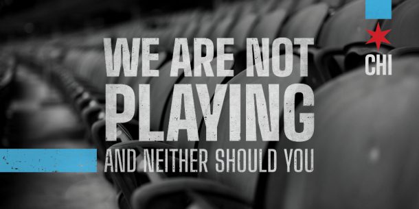
Mayor Lightfoot took position, online, as a visible leader to a citizenry that was reeling from a sudden lack of jobs, opportunities for socializing when those suddenly became scarce, and national leadership. Along with that came daily updates, captioned in Big Shoulders, from the Commissioner of the city’s public health department. I’ve been delighted and proud to see the typefaces used to encourage citizens to stay home and stay safe while we were in lockdown, and later to celebrate the class of 2020 in the first city-wide online graduation ceremony.
Future Usage
Considering how weird things are right now, I have no idea what Big Shoulders is going to mean to the city over the next few years, but we’re hoping for the program to expand across the city. We’ve discussed entryway signage for each of our 44 community areas, and branding for city events like the annual St. Patrick’s Day Greening of the River, the Chicago House Music Festival, and Chicago Jazz Festival. There are initial conversations about rebranding Navy Pier using the program, as well as community-focused monuments in Boystown, Pilsen, and on Paseo Boricua in West Town. There’s a possibility the letters could be set into a “Welcome to Chicago” sculpture at O’Hare International Airport. Everything’s a little up in the air, considering we’re all still working our way through the effects of the COVID-19 pandemic.
In the community, we anticipate seeing this used around the city in pretty much any way, from neighborhood block parties to protests to, I don’t know, a poster for a lost pup (who might be the best Chicagoan pup ever).
We’re not sure yet how quickly awareness and adoption will occur, but early signs show that most people are enthusiastically downloading and using components from the Chicago Design System. Chicagoans love talking about their city (especially to New Yorkers, who’ve always regarded us as a younger, simpler sibling, so of course), and they’re usually energized to see a way to do it alongside or against the government. Both would be completely valid usage.
My hope is that I’ve created a family durable and expressive enough for Chicagoans to enjoy for a few generations. Even further into the future, I hope I’ve made something so uniquely Chicagoan that it helps set the tone for making type here with a distinctive voice. We’ve had notable designers creating letters here over the past couple centuries, from Goudy to Dwiggins to Cooper, but nobody’s been asked, until now, to capture the city’s spirit in letterforms. I hope Big Shoulders does that idea a durable service.