No products in the cart.
Okoye? Okay!
What's a 'Quirkhorse'?
Okoye sits in a space between the bonkers curviness of 19th century grotesques, and the sandblasted neutrality of 20th century models.
Both extremes are nice, but there’s something to be said for neutrality with some character still in place, yeah? Yeah!
Okoye’s weights are interesting: Thin to Light are almost totally monolinear. Regular to Black: progressively contrastier.
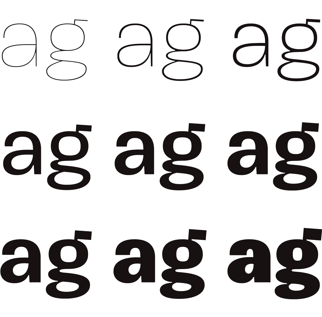
Default spacing got a healthy consideration in the design process as well: Thin to Light are spaced broadly. Regular begins closing spaces between letters; Black is very tight, for brash headlines.
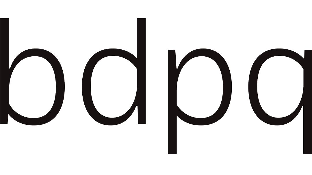
Bowls swoop into stems on b, d, p and q, to feel handwritten.
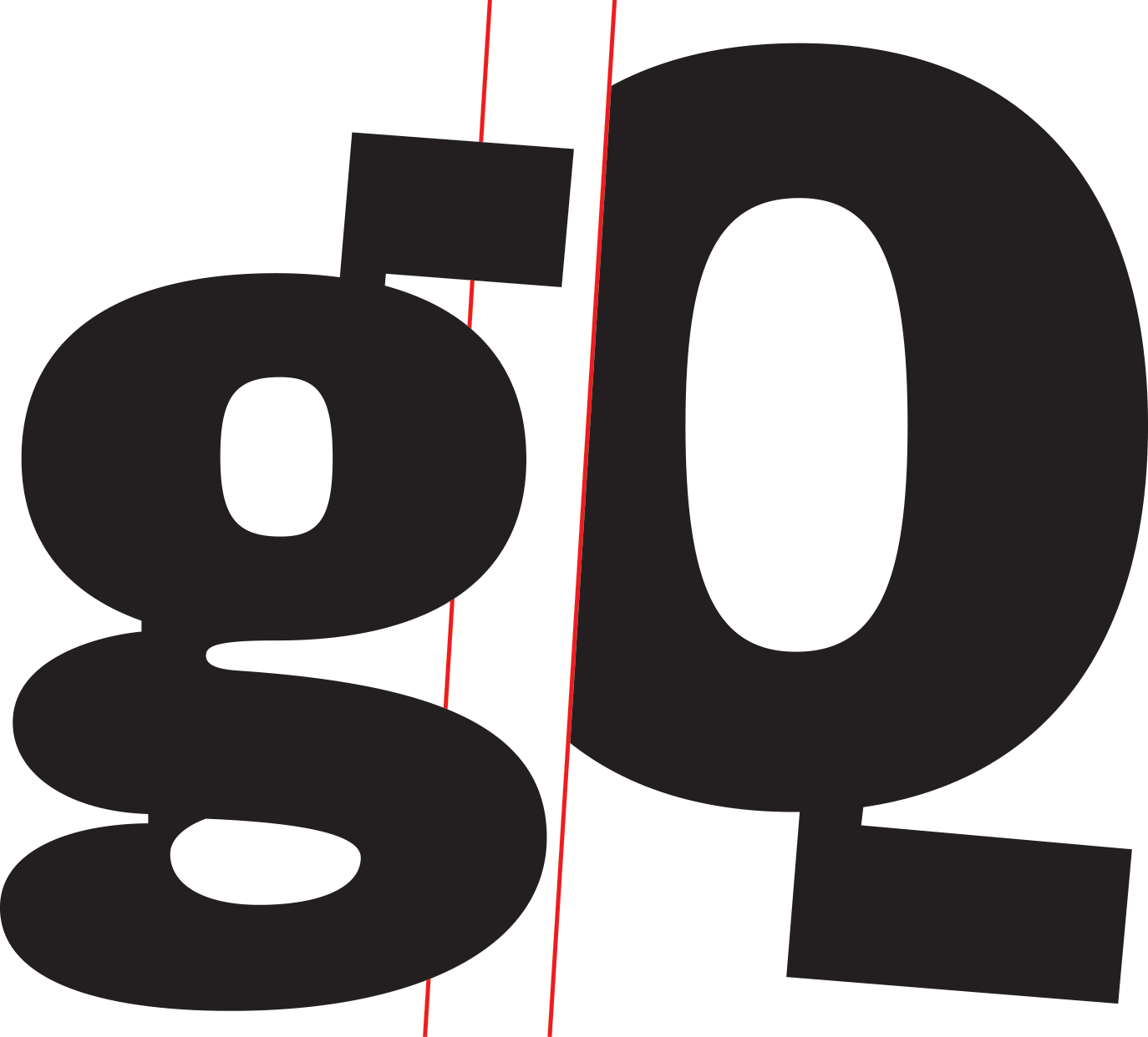
In contrast, I designed a jutting promontory to be g’s ear and Q’s tail; little angular jetties sticking out into a sea of roundness.
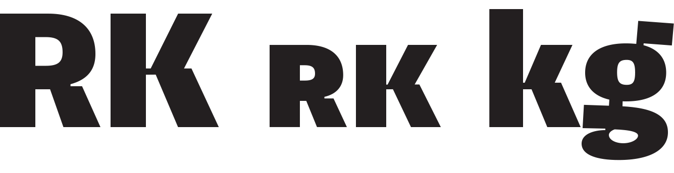
Angularity also shows up in alts for K, R, g, and k. Their lower strokes and legs jut with the same enthusiasm as g and Q.
In all weights, there is motion: open rounds like C, G, S, c, e and s have a slight overhang on top and a squared lower half—a lean to the right. That is to say: Okoye is a little bucktoothed.

If you’re using Okoye for interfaces, each weight lines up at 100-900 in the CSS specification you already know: Thin is 100, Regular is 400, Bold is 700, Black is 900.
There’s extensive Latin language support, a set of small caps which mirrors full-size caps exactly (nice for labels on controls), and arrows to point out important things in text or interface.
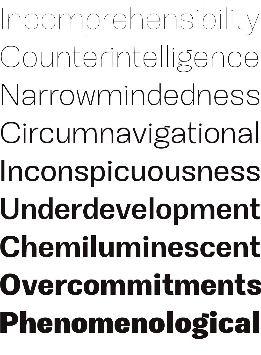
Okoye will be your quirkhorse: hardworking, with personality.