No products in the cart.
Bronzo Fonts
Bronzo’s shapes are a distillation of durable ideas that appear repeatedly throughout the last 150 years of type design. They can seem totalitarian in their forcefulness, looking very much like Russian Constructivist forms. Viewed through another lens, Bronzo has the grace of Geometric Art Deco. And viewed through still another, it’s as exuberant as American Streamline. Because of that multiplicity, I’ve always considered Bronzo a syllabary for display typeface design. It’s sort of an ur-typeface for Patric.
TRY ME.
Bronzo was originally designed at Thirst, in Chicago, by Rick Valicenti & Mouli Marur in 1989, to complement Gilbert paper’s Esse line of papers. The typeface itself became wildly popular—so much so that Thirst released it in 1990. That event also kicked off a new digital type foundry, which Rick named Thirstype.
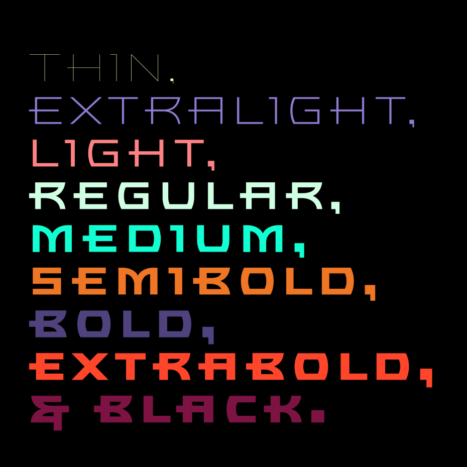
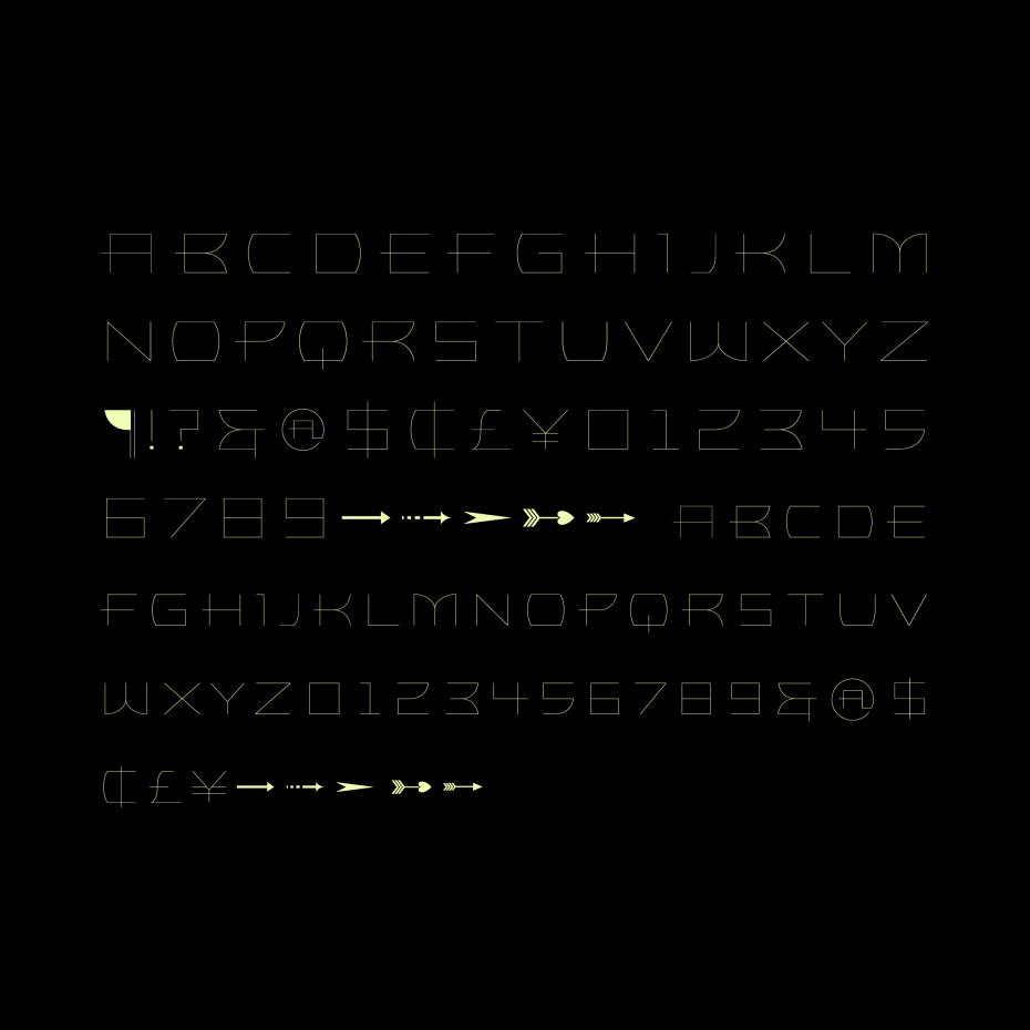
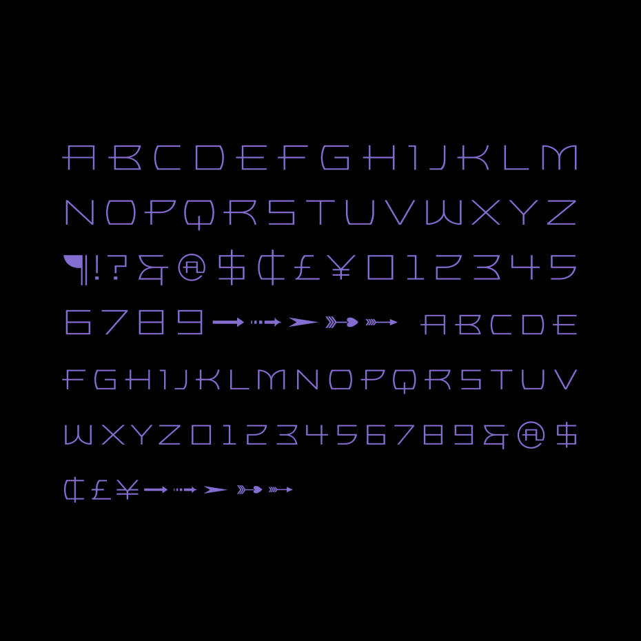
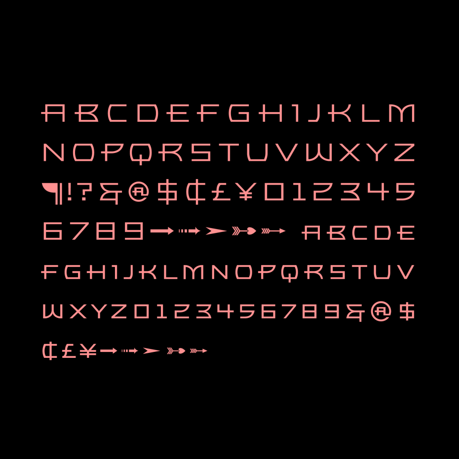
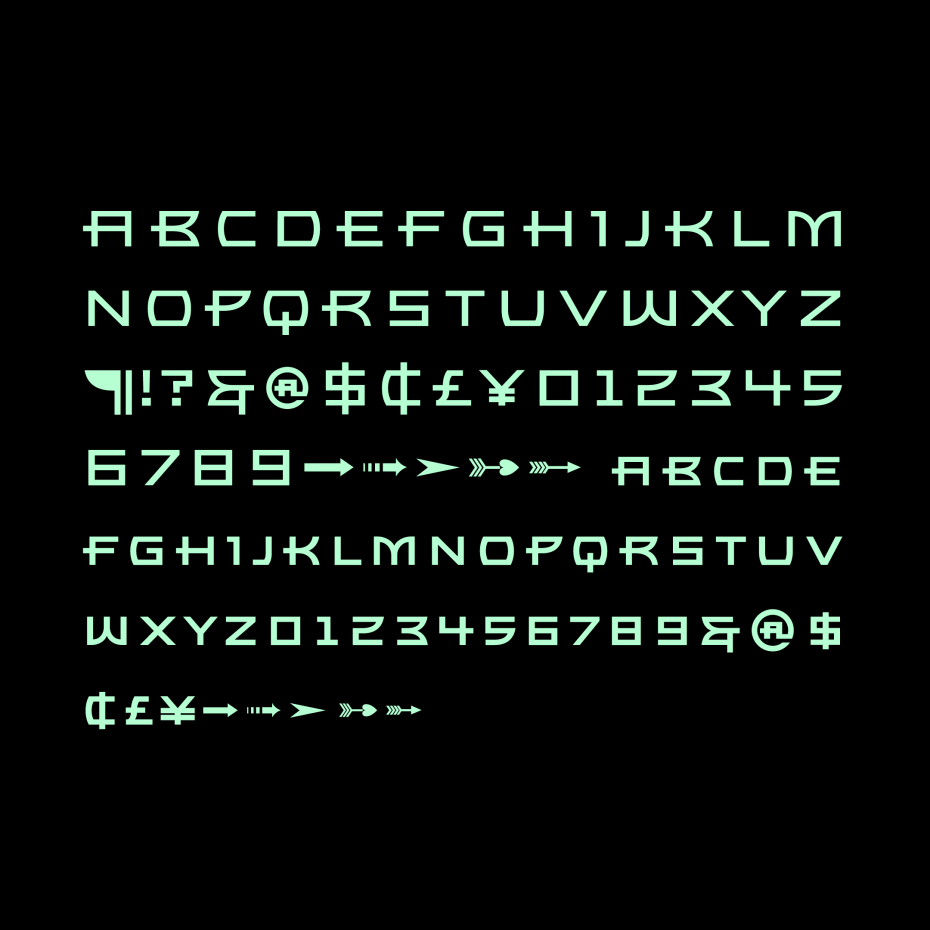
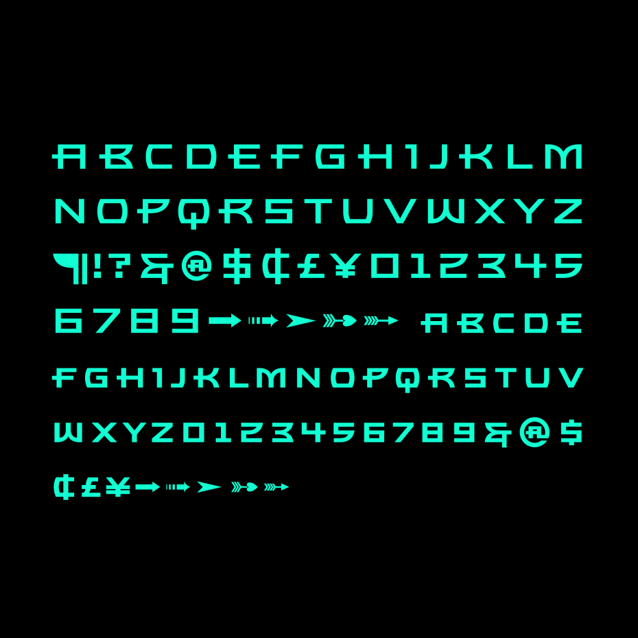
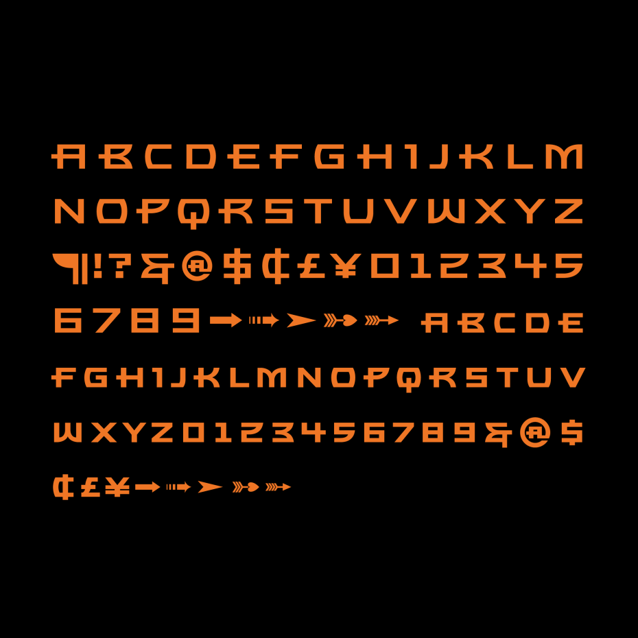
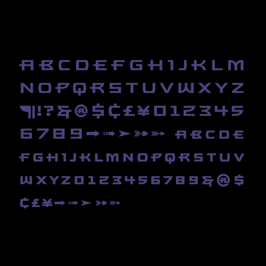
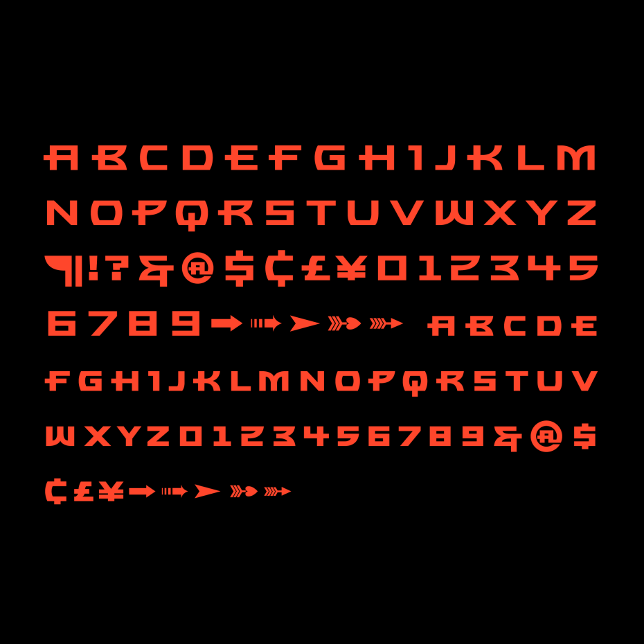
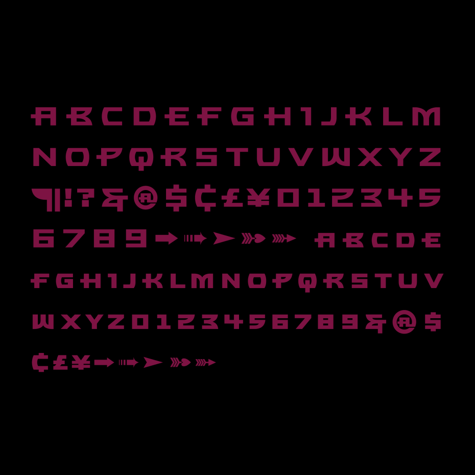
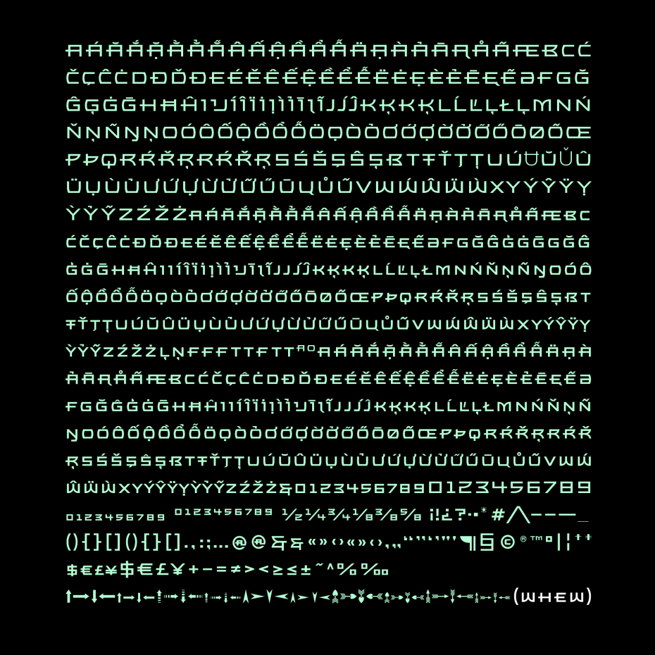
When Thirstype went away in the mid-2000s, so did Bronzo—but a design so iconoclastic should live on. This redesign of Bronzo expands it from the original three weights—Light, Regular, and Bold—to nine, with brand new thinner and thicker extremes. There is also a ton of new language support, and totally redesigned accents.
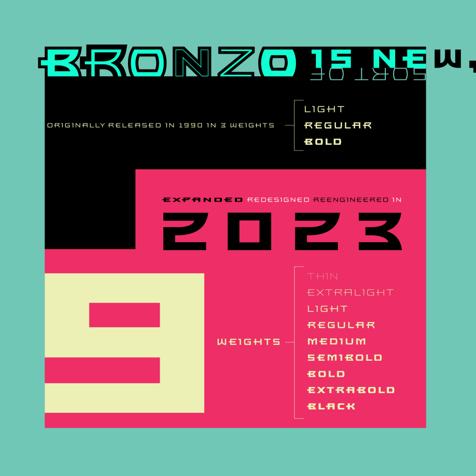
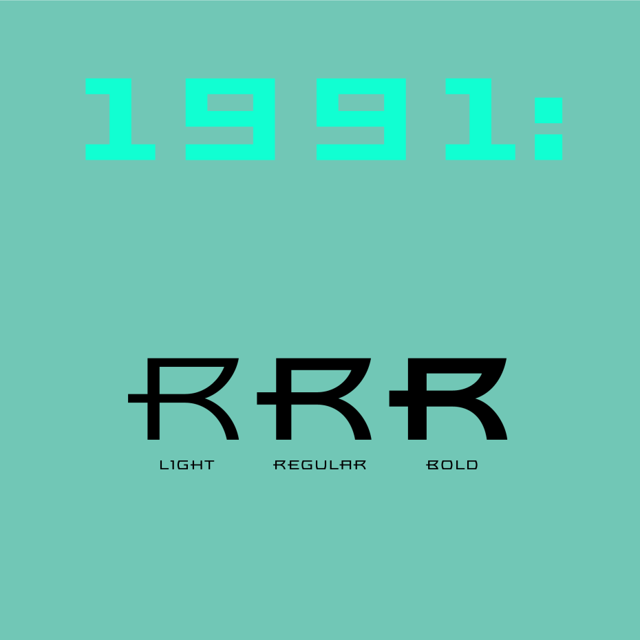
Bronzo was, originally, three weights: Light, Regular and Bold, every weight drawn by hand. (Superfamilies weren’t technically feasible until a decade later.)
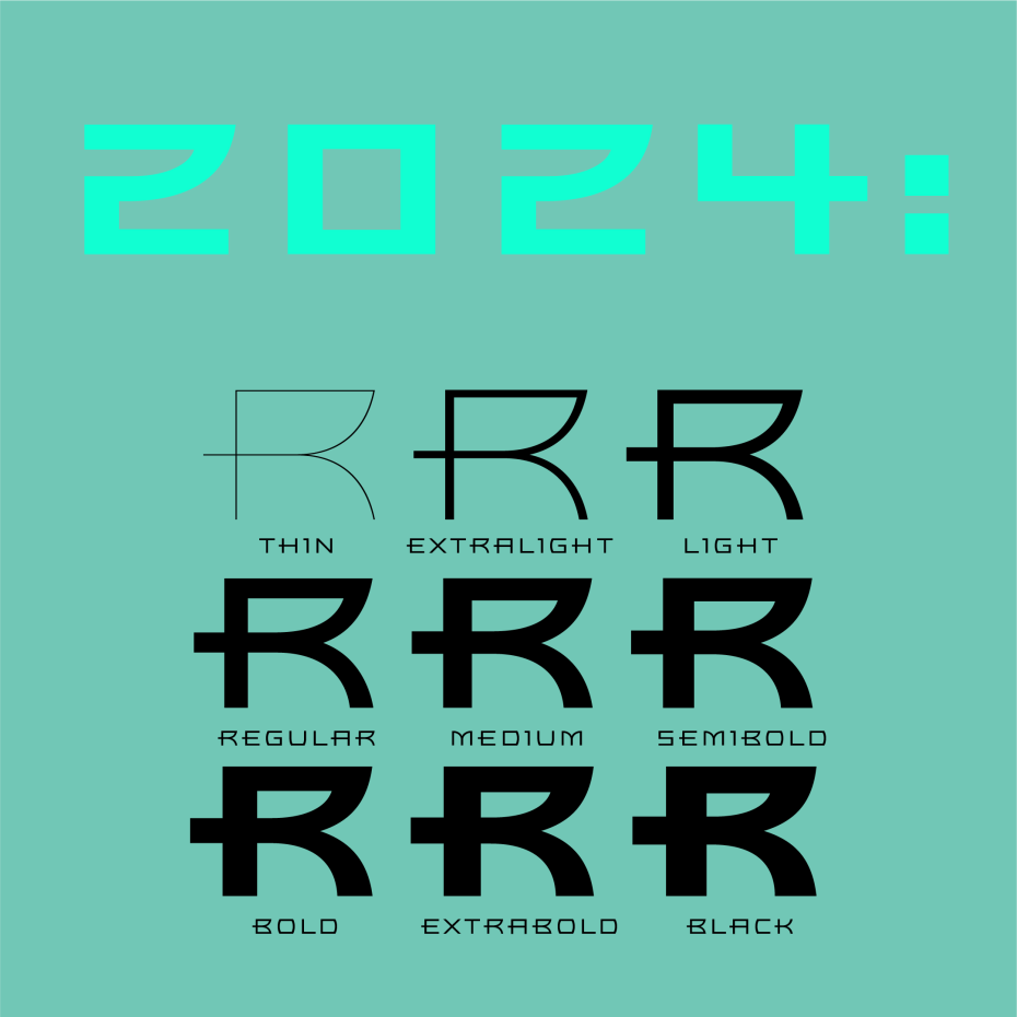
With this new release, I’ve expanded Bronzo to nine weights: from a delicate, monolinear Thin all the way up to a thick, muscular Black.
This weight expansion was a tricky maneuver, in that I needed to discover the proportions creating the original weight changes, and then expand beyond and through them—lighter, bolder, and in between. Bronzo Thin and Extralight have never existed, nor have Bronzo Medium, Semibold, Extrabold, or Black.
To make these new weights, I measured differences in thickness and width from the original Light to Regular to Bold, then used the mathematical ratios I found, and exaggerated in both directions of the weight axis. Then, I amplified what I liked to make weight differences clearer.
Regular remains close to its original weight. Light is now a bit lighter, Bold is a bit bolder. With those tweaks, Bronzo has become more athletic in scope.
Even though I worked with Bronzo regularly at Thirst, I never understood why it sparkled to my eyes as it did. I had to take it apart and reconstruct it to understand its tension, its whole vibe. This is what I found:
Bronzo appears to always move forward, but also remain still, via an ingenious construction: a center stroke that only ever sticks out on the left, never the right. A tense curve system that only ever happens on the right, never the left, and always steps out, so that curves never seem quite complete. And a width that sits uncomfortably between square and rectangle. Those three things, combined with a carefully balanced light to dark ratio, are what makes Bronzo always tense and ready.
Bronzo’s shapes are a distillation of durable ideas that appear repeatedly throughout the last 150 years of type design. They can seem totalitarian in their forcefulness, looking very much like Russian Constructivist forms. Viewed through another lens, Bronzo has the grace of Geometric Art Deco. And viewed through still another, it’s as exuberant as American Streamline. Because of that multiplicity, I’ve always considered Bronzo a syllabary for display typeface design. It’s sort of an ur-typeface for me.
Bronzo utterly ignores graphic design’s primary rule: don’t stretch the type. Bronzo’s widths and contrast were, in fact, created by stretching existing typefaces to sculpt its initial 1989 sketches. Bronzo is designed to be stretched, warped, and slanted—and it gains energy from those very modern sins.
Bronzo has an intrinsic dichotomy: it accepts Modernist ideals of minimal, rational construction—but it also adopts a luxuriant shape vocabulary over Modernism’s sandblasted, boring neutrality. It’s almost an alternate reality, a “what if?” of Modernism. Modernism’s fun, interesting, cute reboot.