No products in the cart.
Havelock Fonts
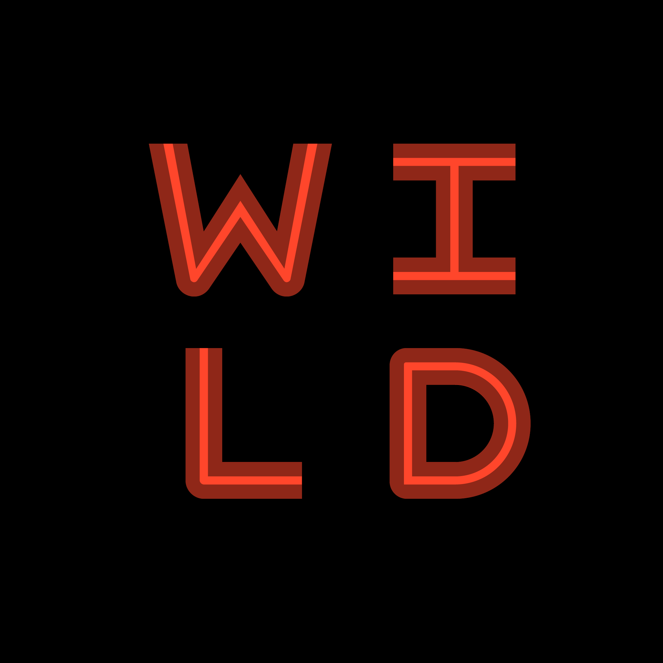
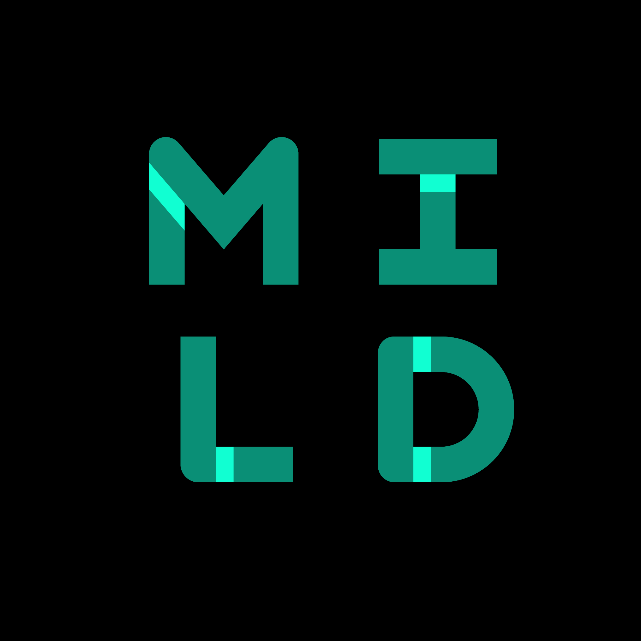
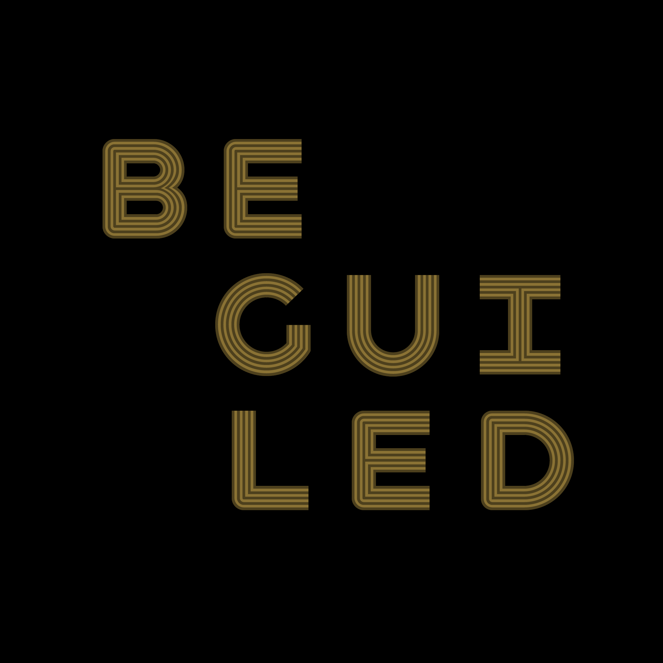
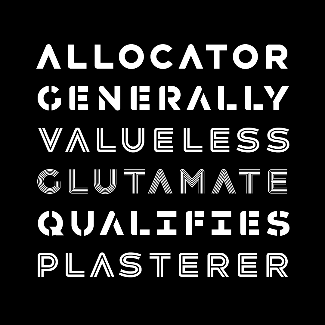
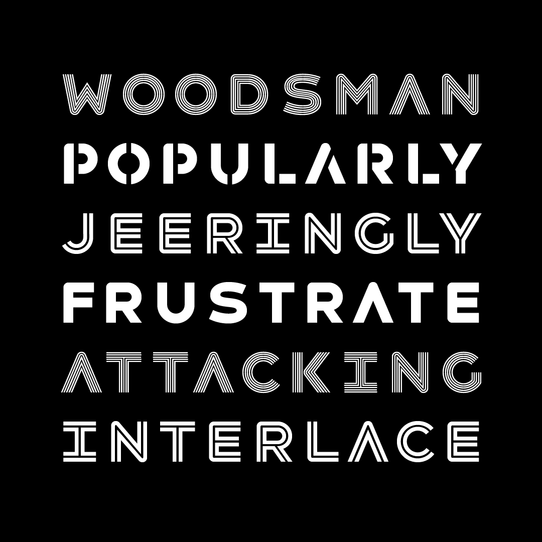
Havelock is an all-caps display family, made specifically for designers to layer and play with. It combines hard and soft, geometry and pattern. Layer and mix styles within a single word, retaining coherent visual tone. Havelock Solid operates as a background layer, Multiline sits nicely atop it, Inline frames Multiline’s center strokes, and Stencil lets details peek through. If you’re working with translucent color, the blending can be gorgeous.
TRY ME.

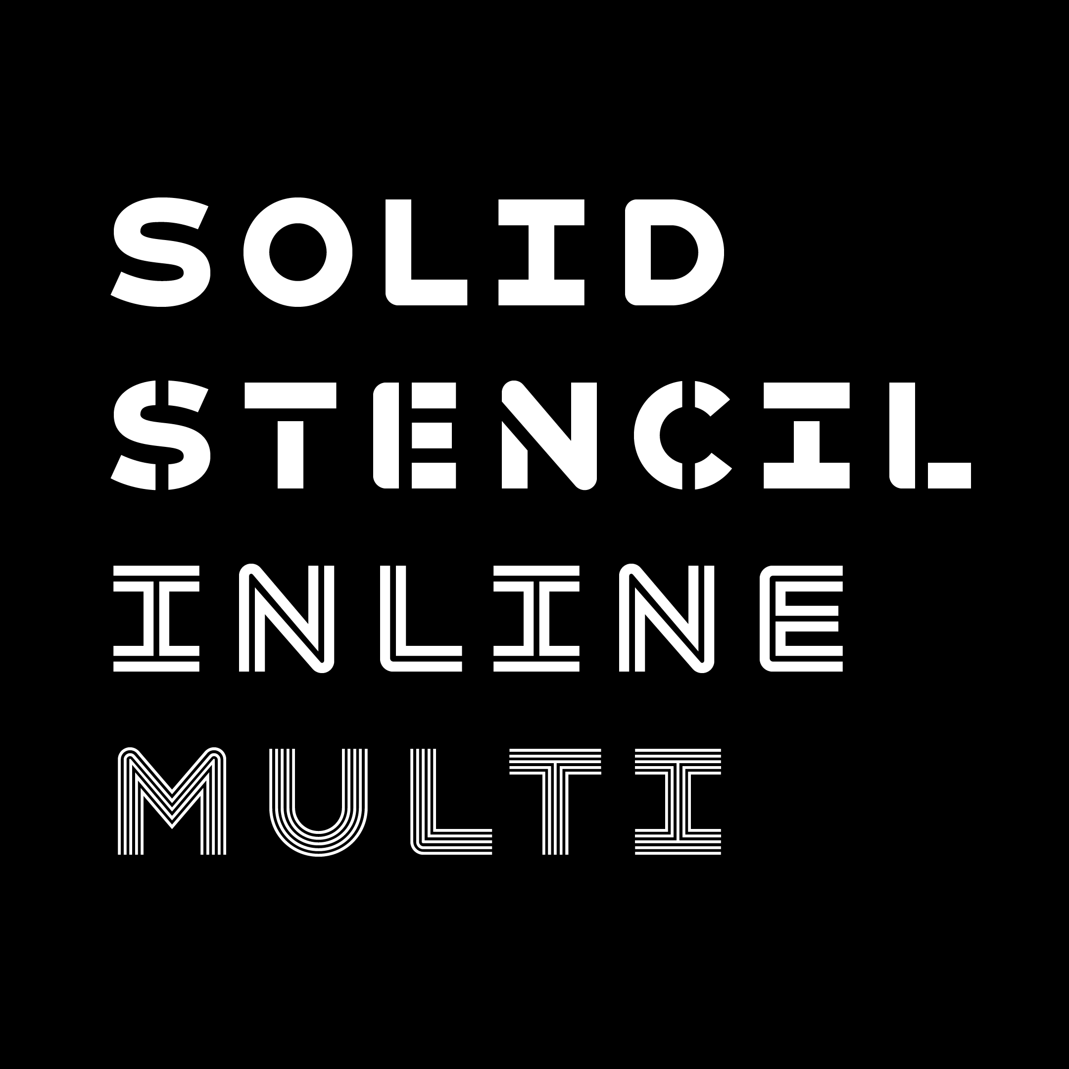
Havelock is four related typefaces built to layer with transparency effects, and make interesting forms with those layers.
Solid is the base layer, fill it with solid color. Atop that, you can layer Inline, Stencil, and Multiline. Each of those has cutouts drawn to fit nicely within each other, no matter how you layer them.
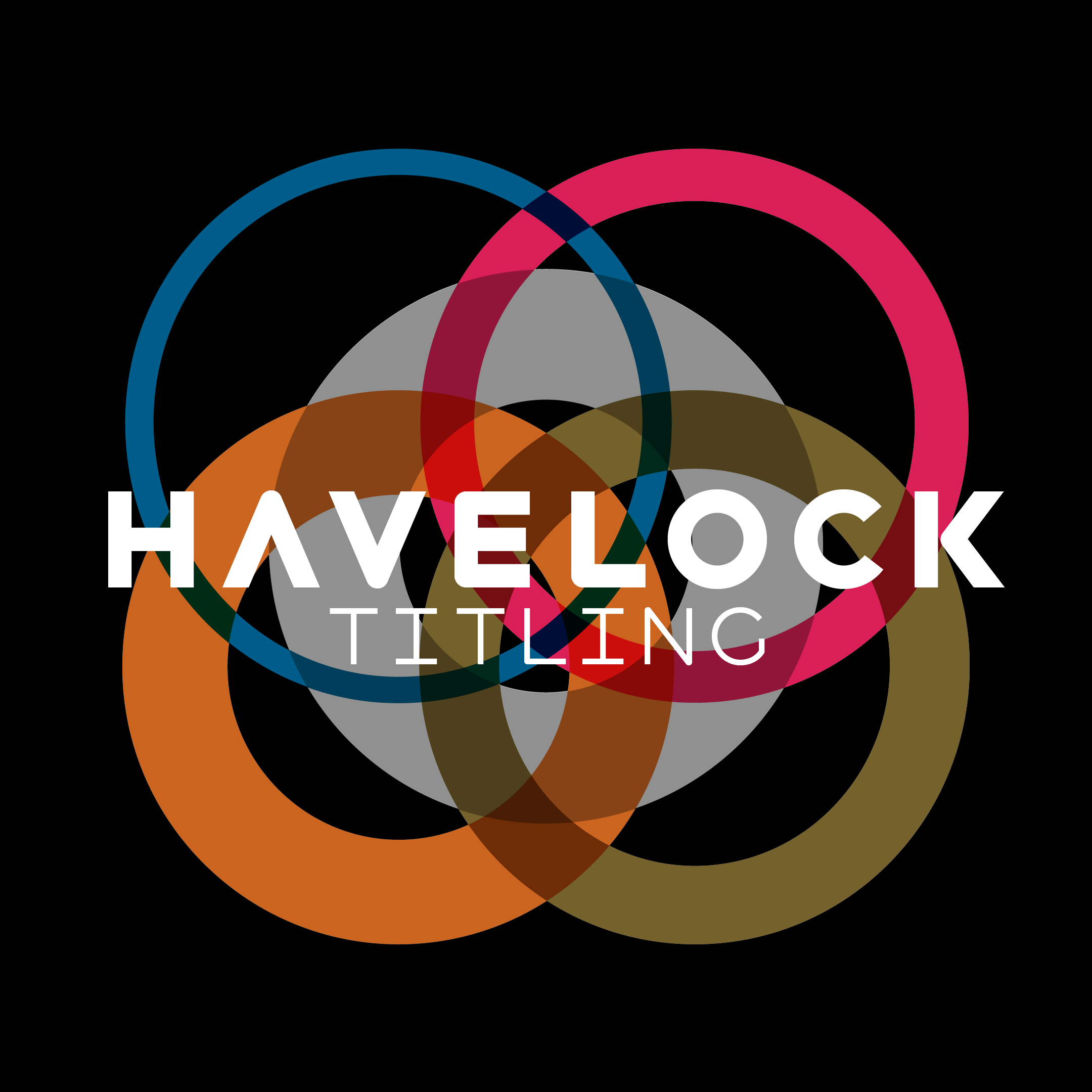
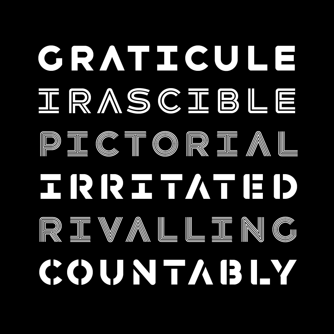
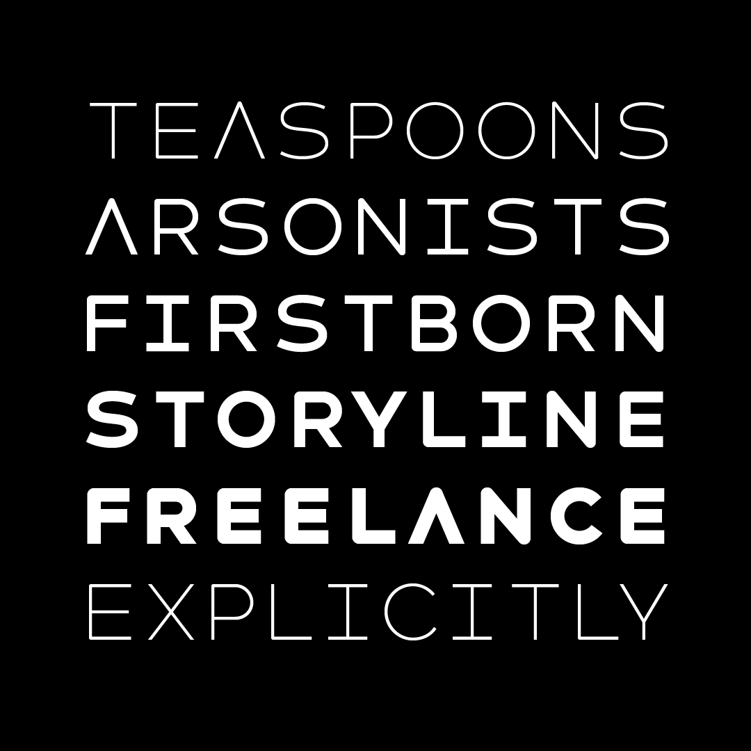
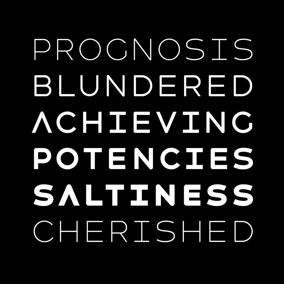
Havelock Titling actually came about after Havelock—it became clear that designers liked the essential geometry for its beautiful, clean, aerodynamic shapes—but wanted to use it without layering effects.
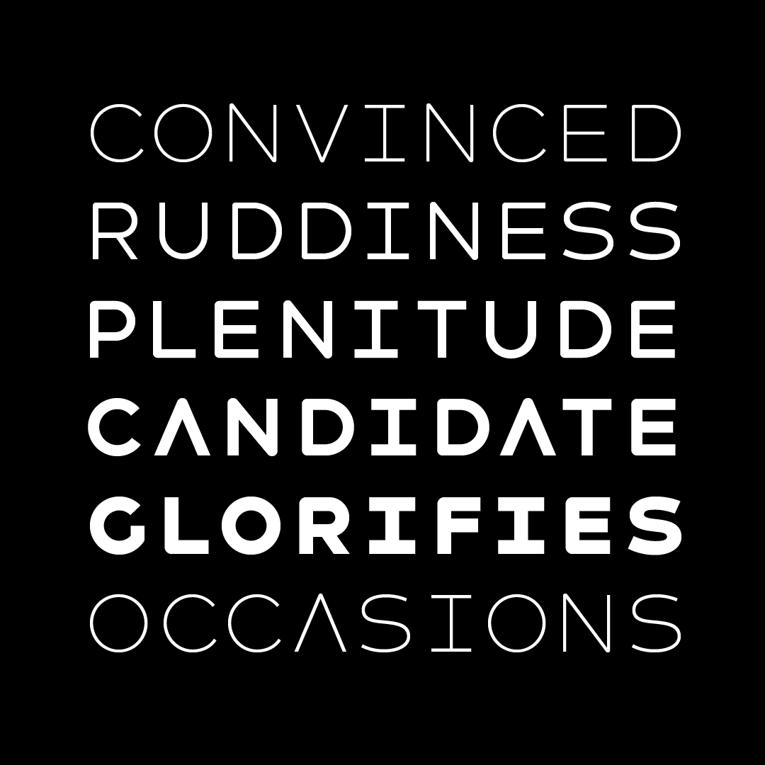
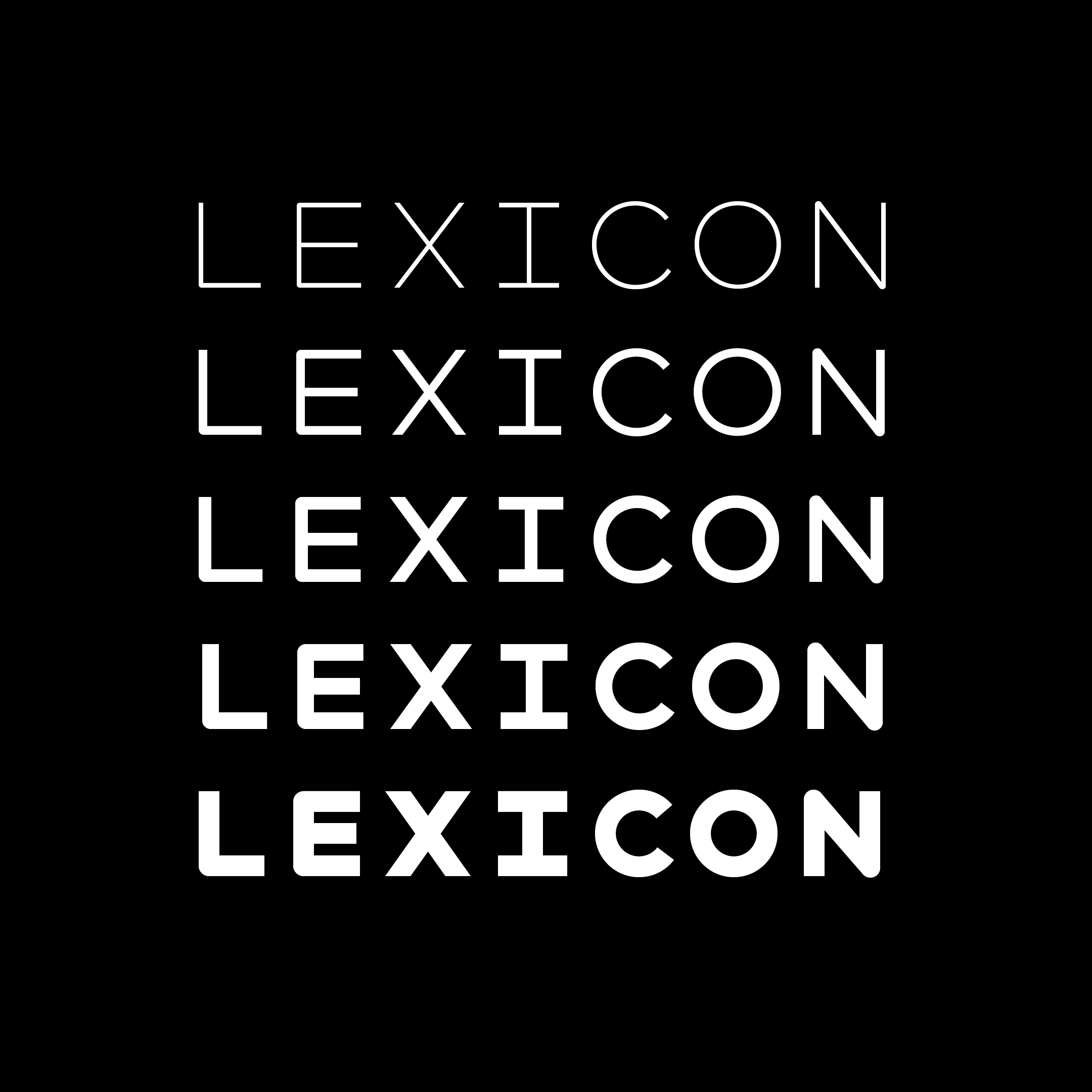
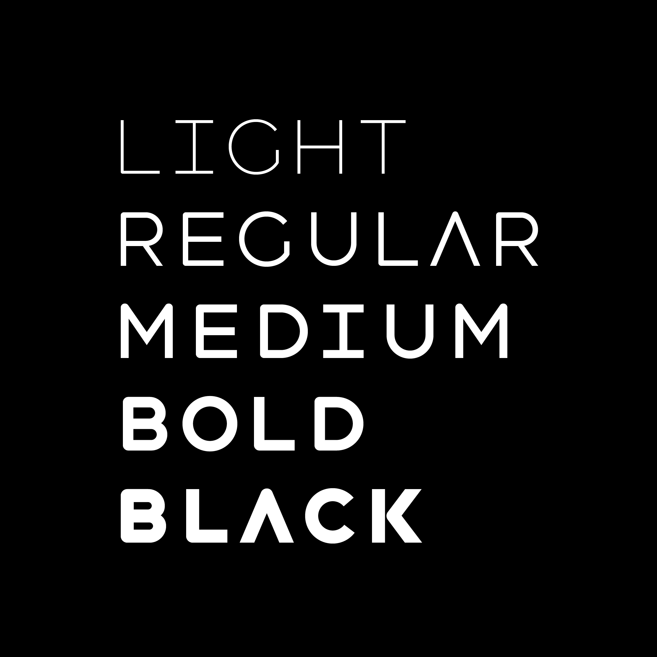
Havelock Titling uses Havelock’s essential shapes, and iterates those shapes through five weights—Light to Black.
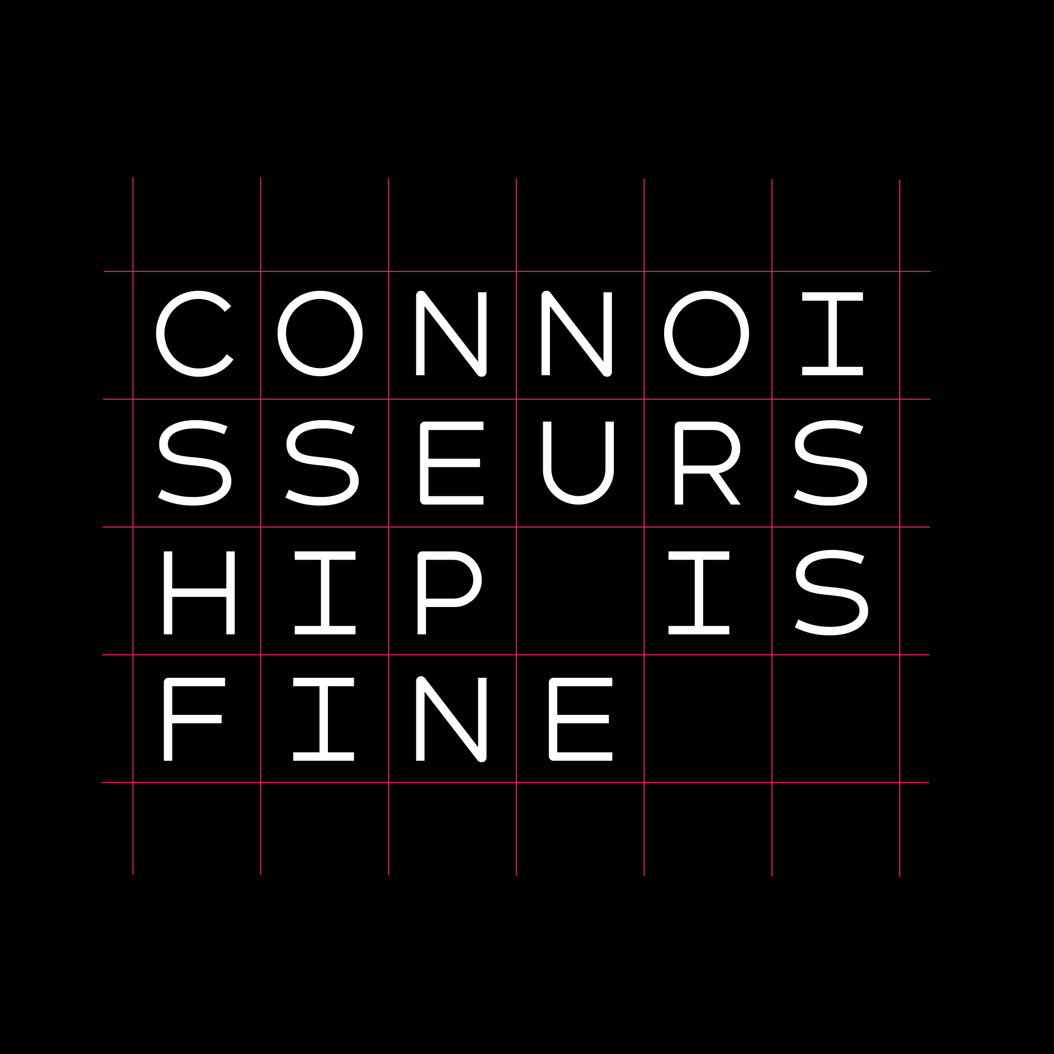

Havelock is made to play with, and to make very graphic shapes. It gives the impression of being a neutral typeface—one you don’t really notice while reading—but it is actually very, very there. Havelock’s shapes and spaces are quite distinct.