No products in the cart.
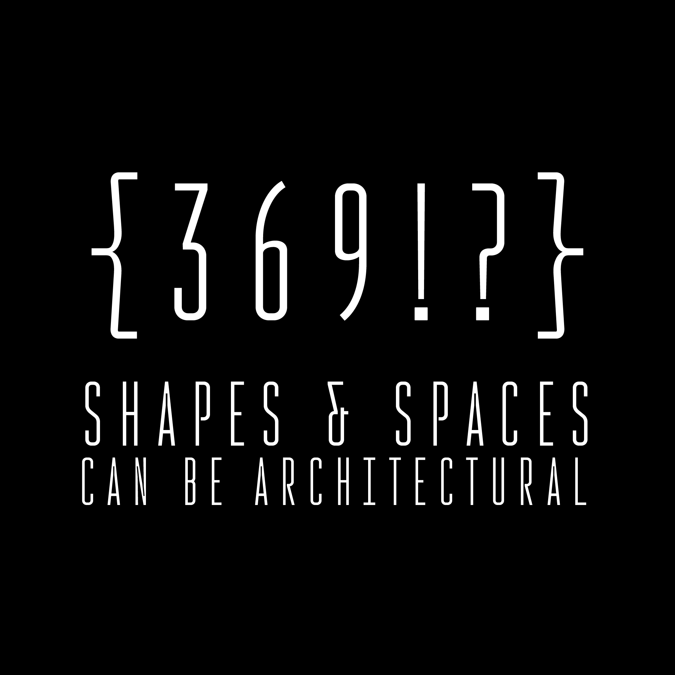
Rocinante Titling Fonts
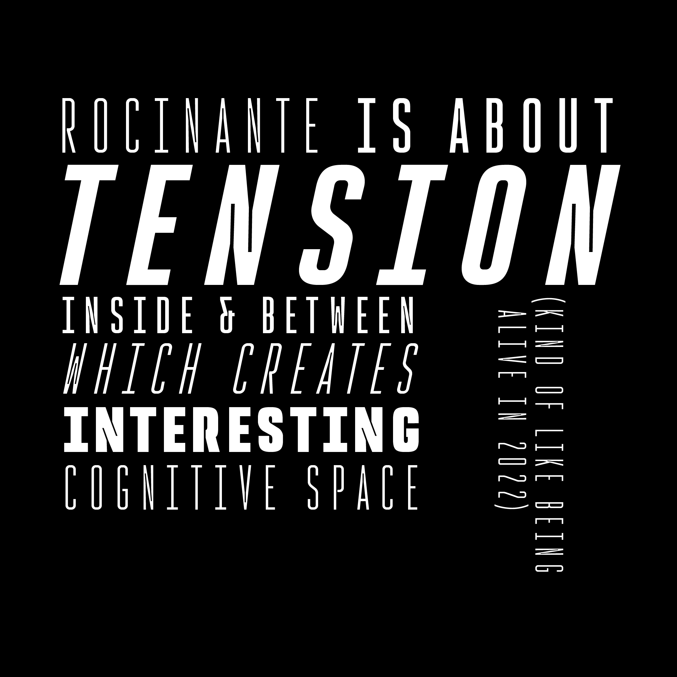
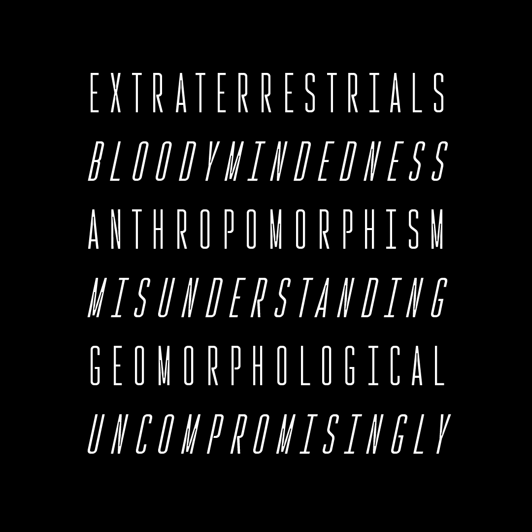
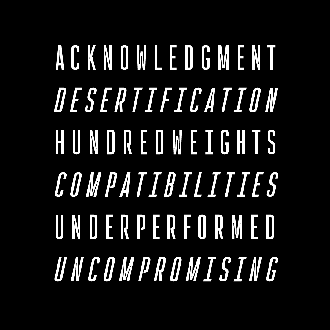
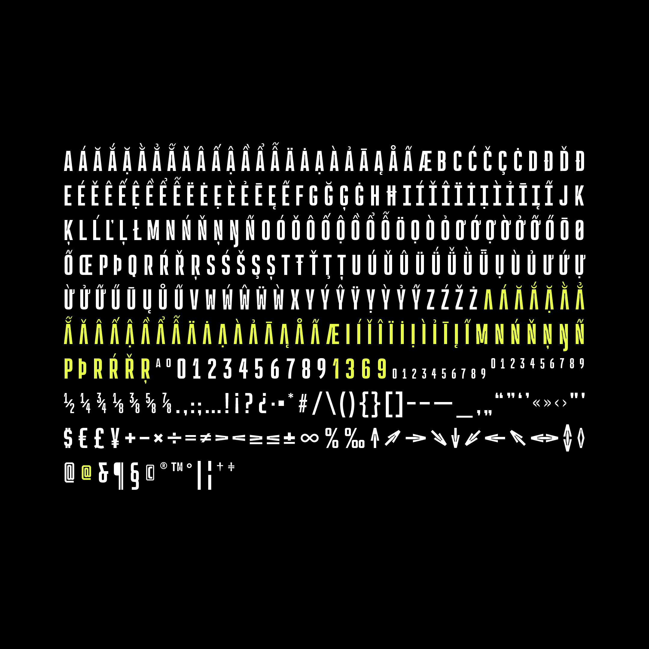
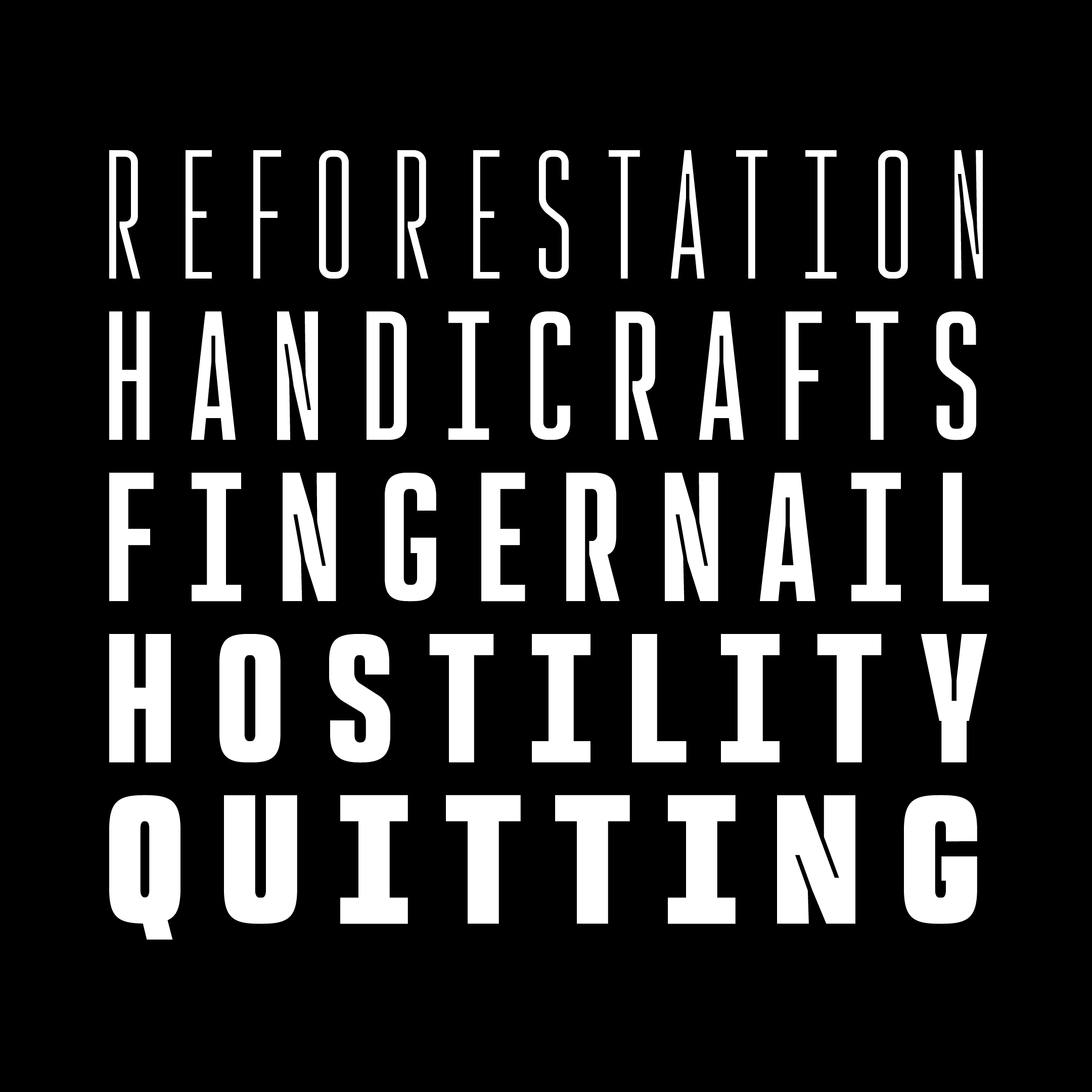
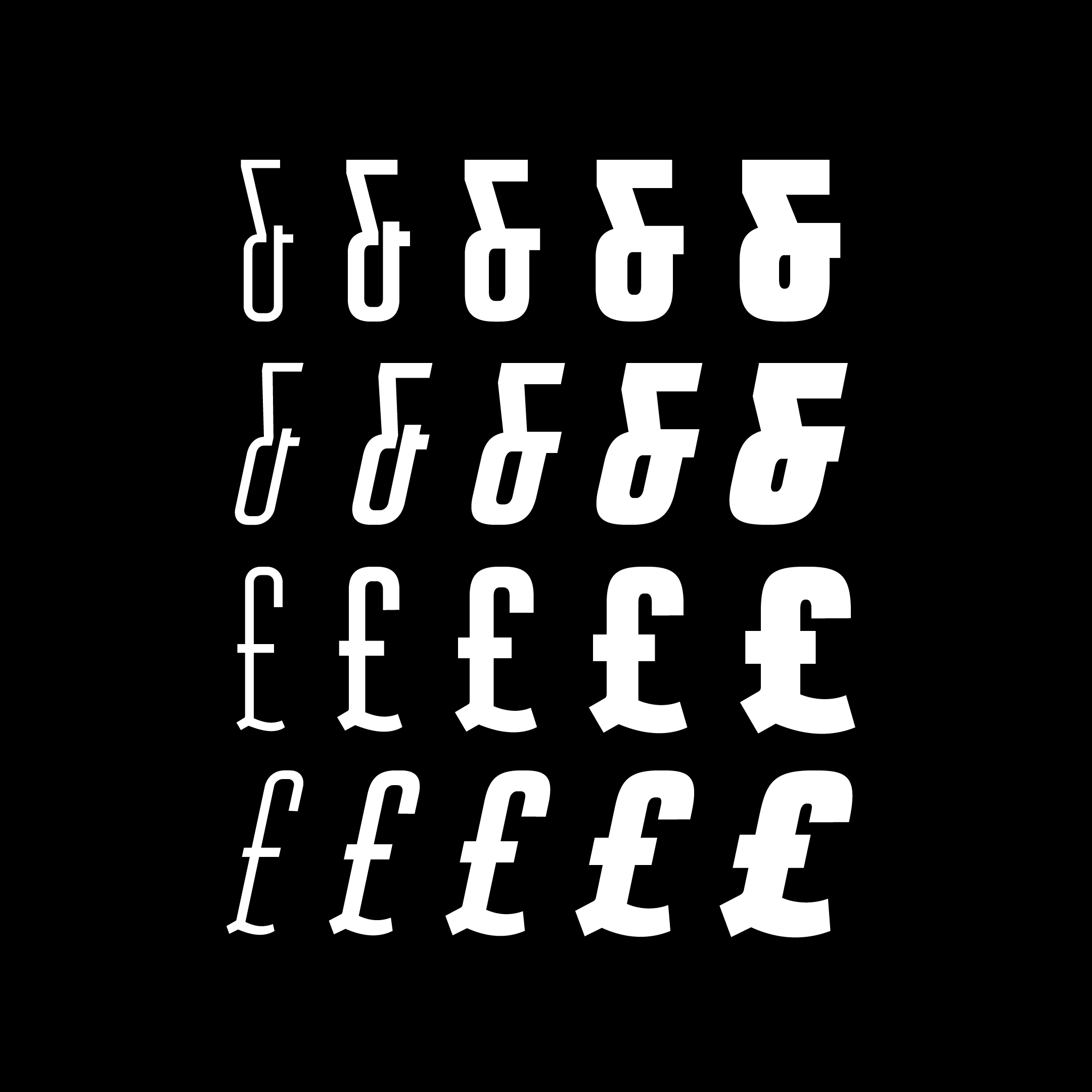
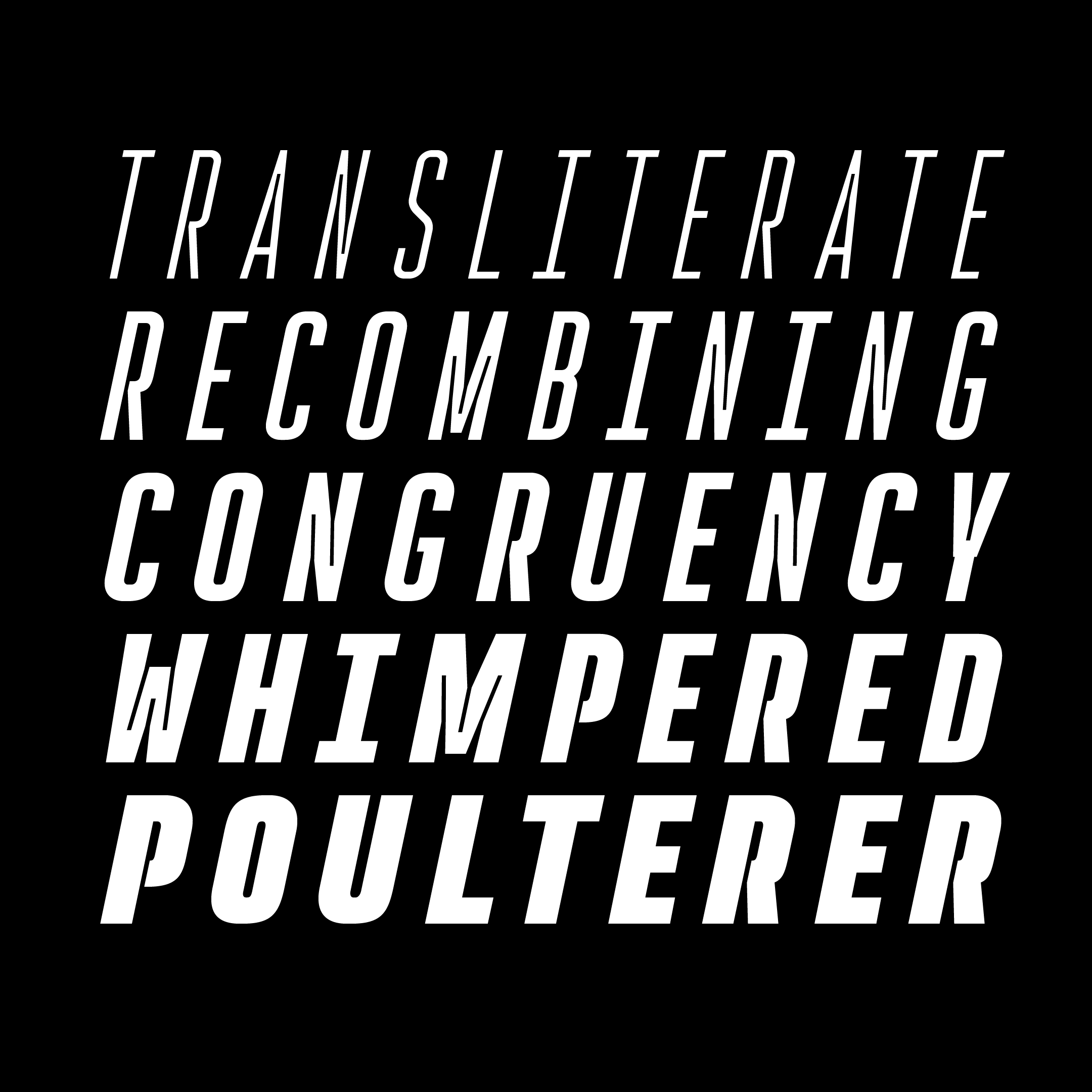
Rocinante Titling is a study in interior and exterior tension packed into a tall, somewhat geometric frame. Lightwells, expanded and enlarged to declare them a design detail and not just a functional compensation, define narrow spaces where strokes must bend to intersect. Rocinante Titling’s stroke weights and spacing match all those of Havelock Titling. Make new combinations while retaining rhythm. Light matches Light, Regular matches Regular, and so forth.
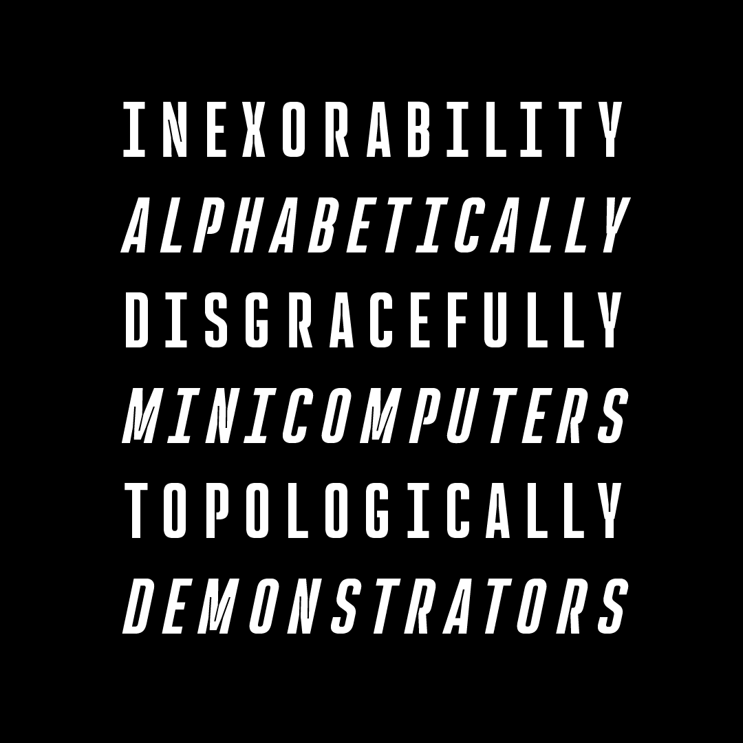
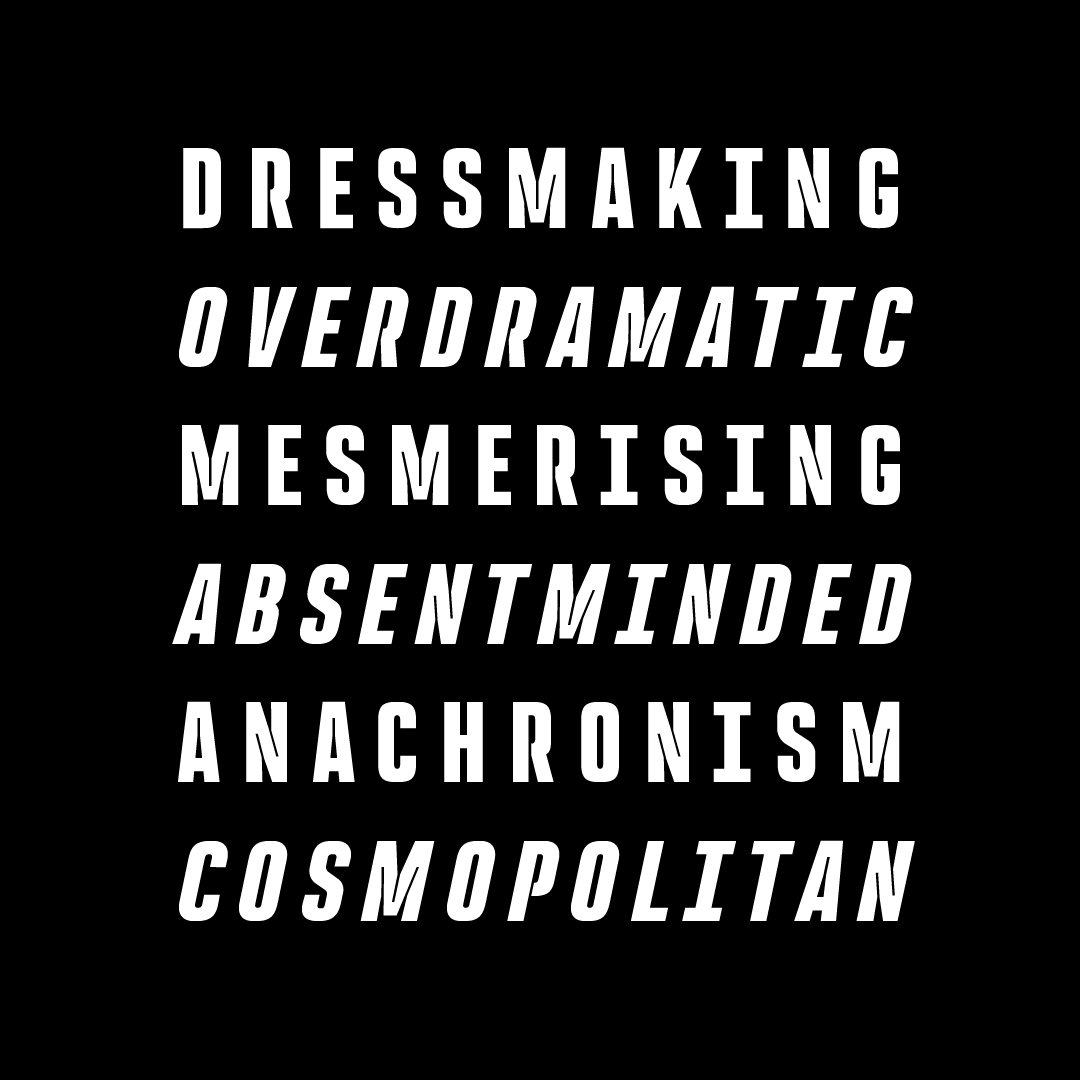
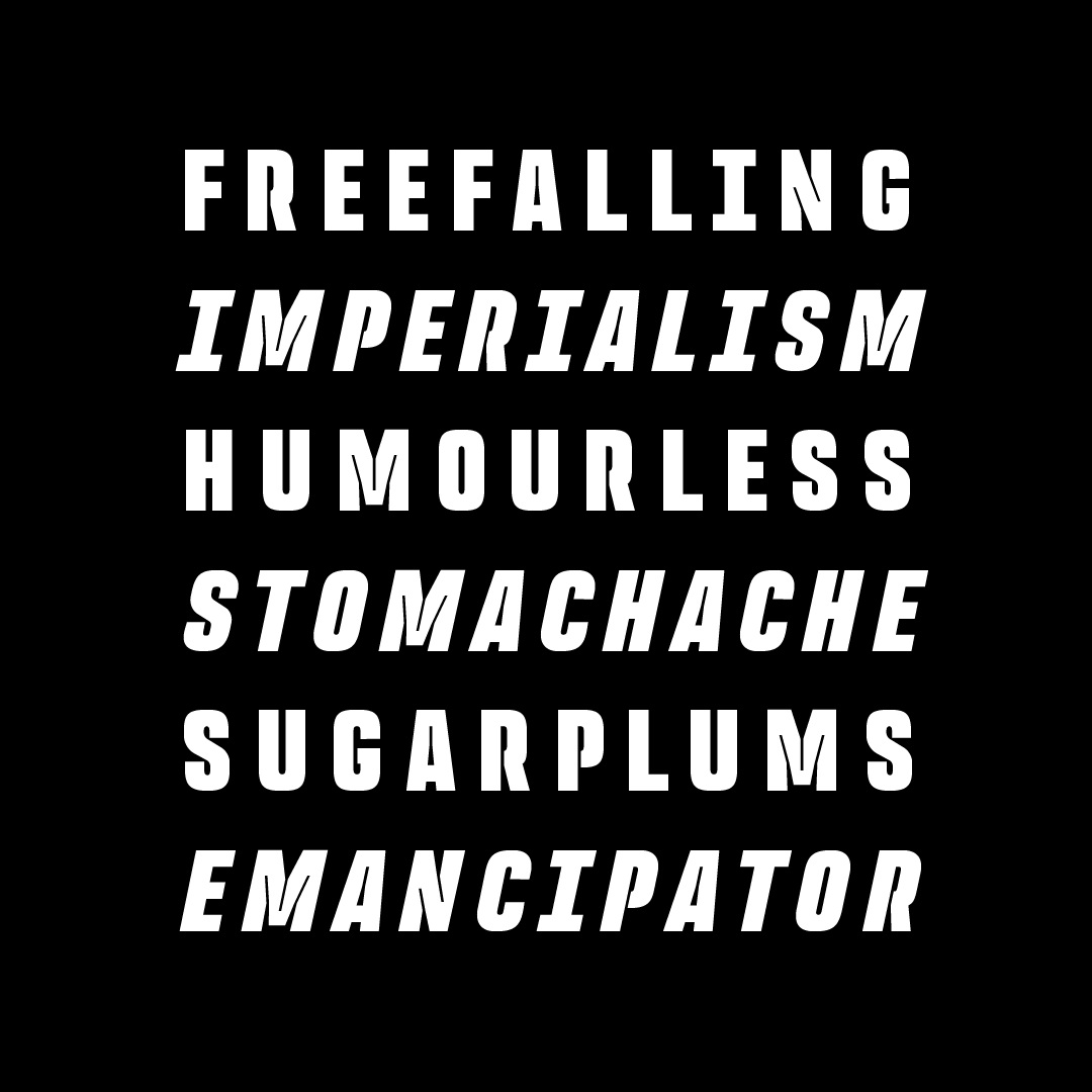
TRY ME.
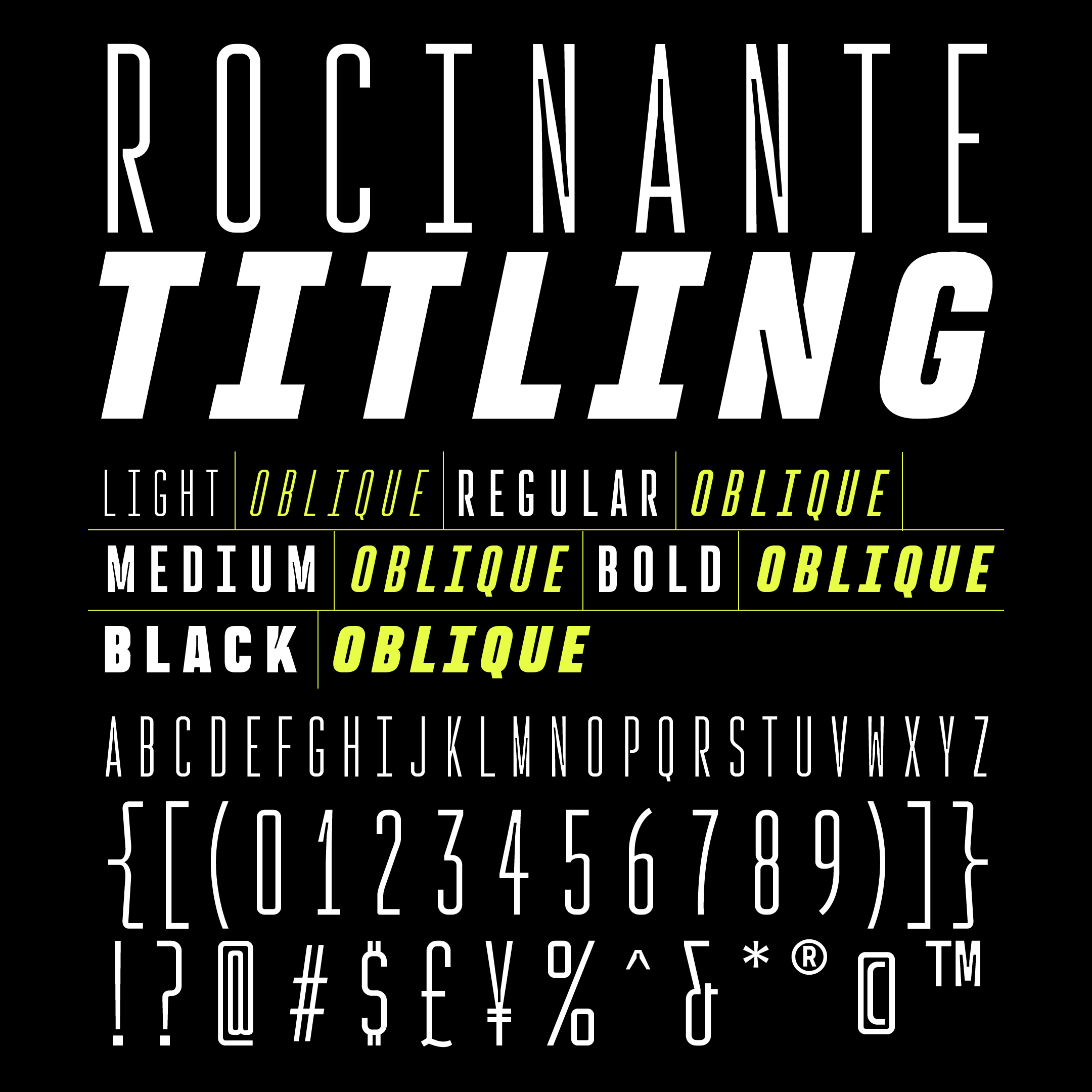
Fun fact: all of Rocinante’s weights align exactly with those in Havelock Titling. You can combine those two for further contrast: the narrowness of Rocinante with the luxurious roundness in Havelock; the tense squareness in Rocinante with the round bubbly joints in Havelock.