No products in the cart.
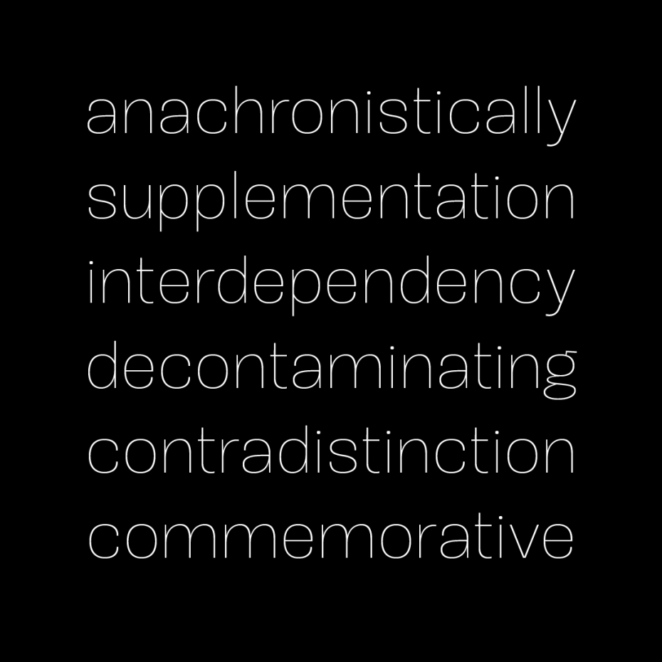
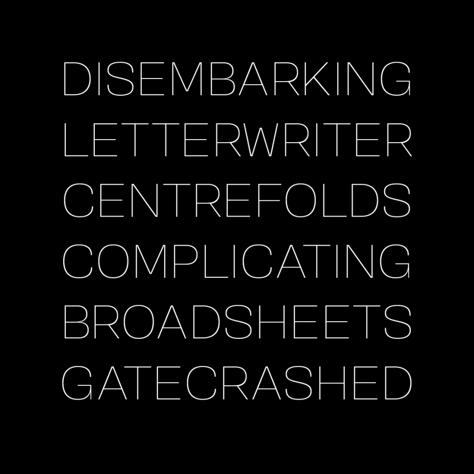
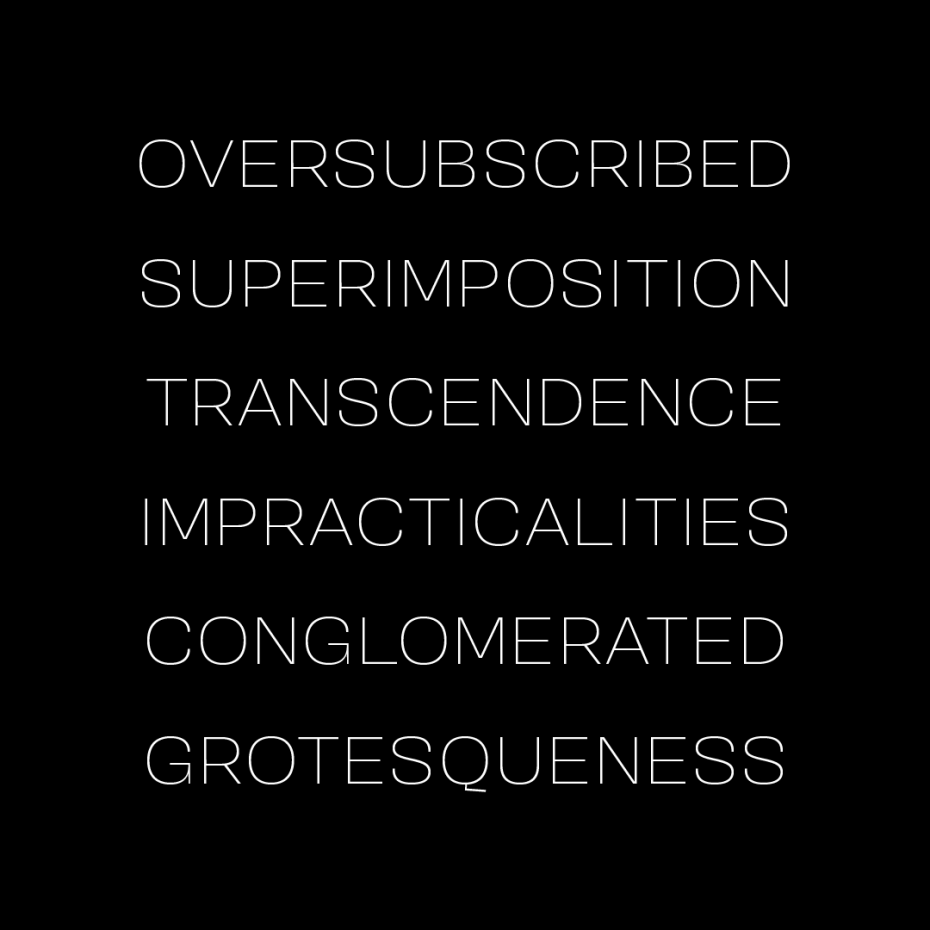
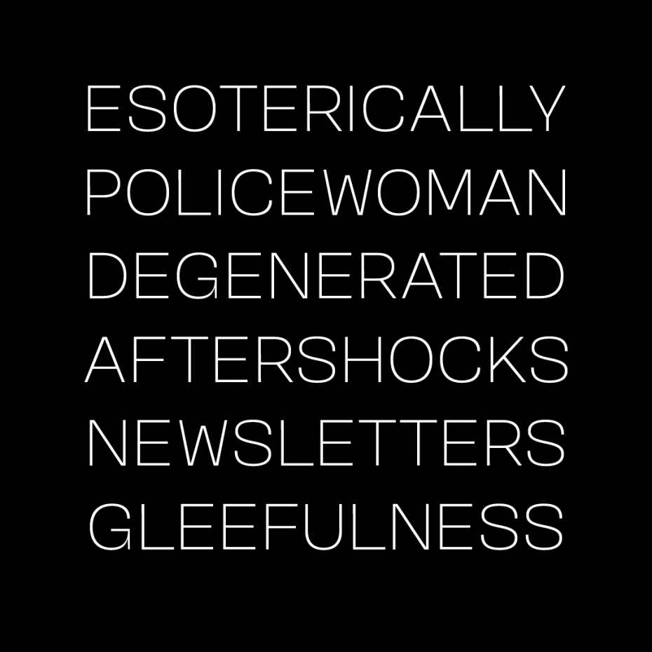
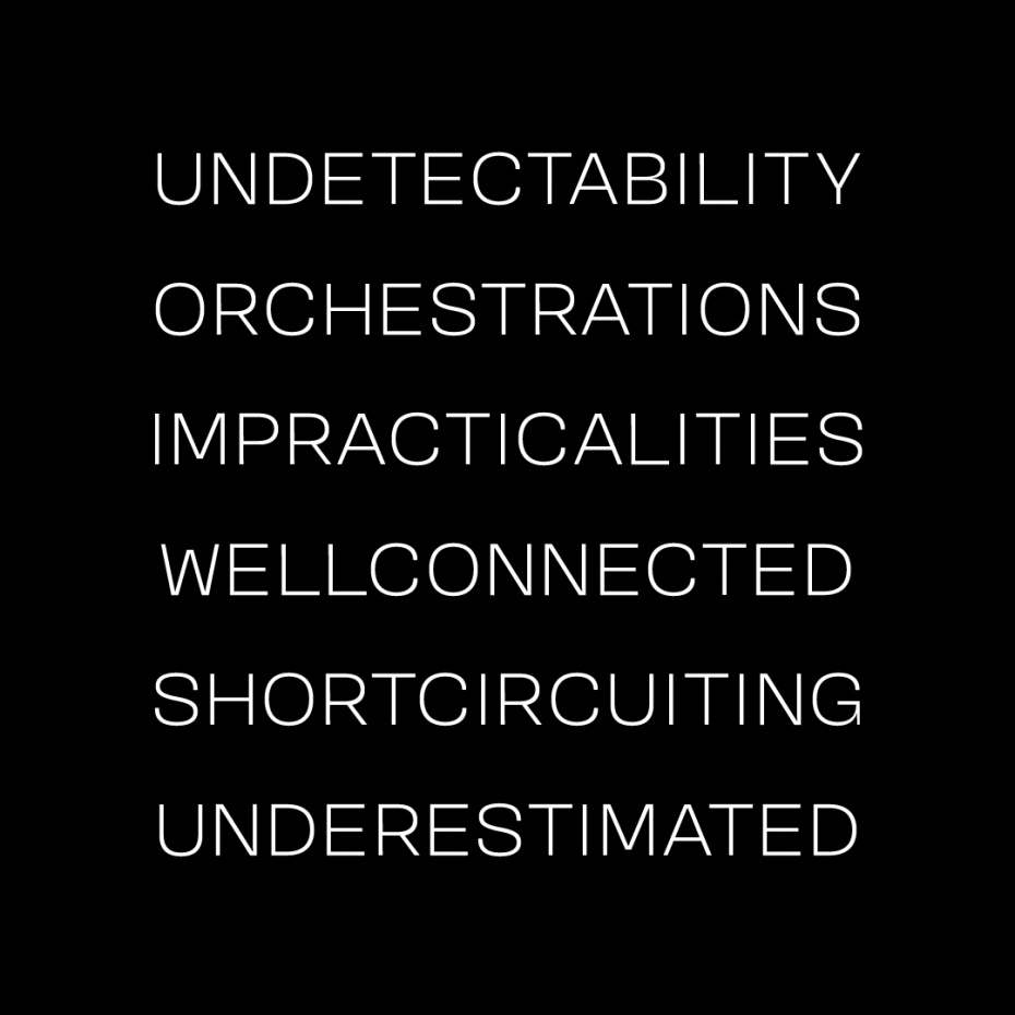
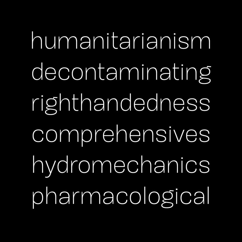
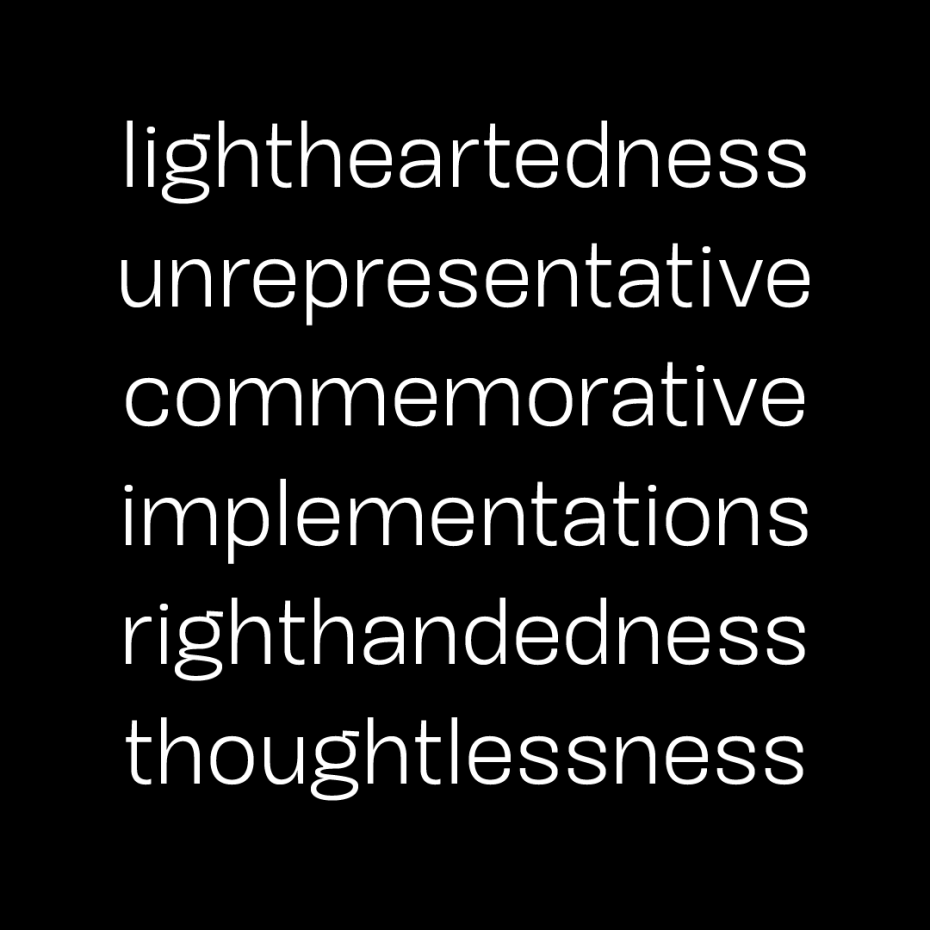
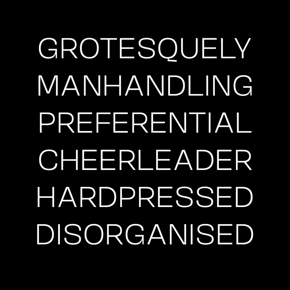
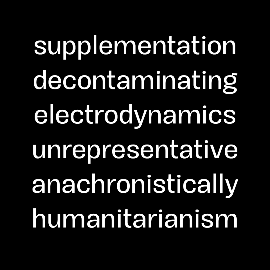
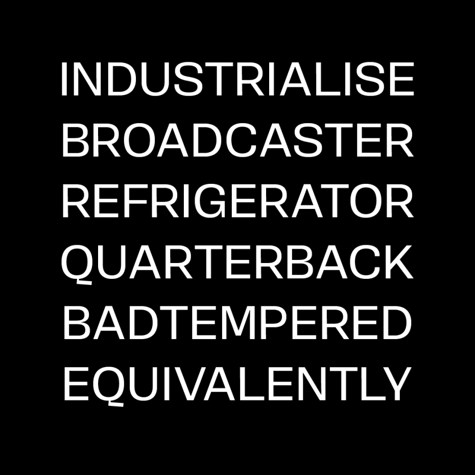
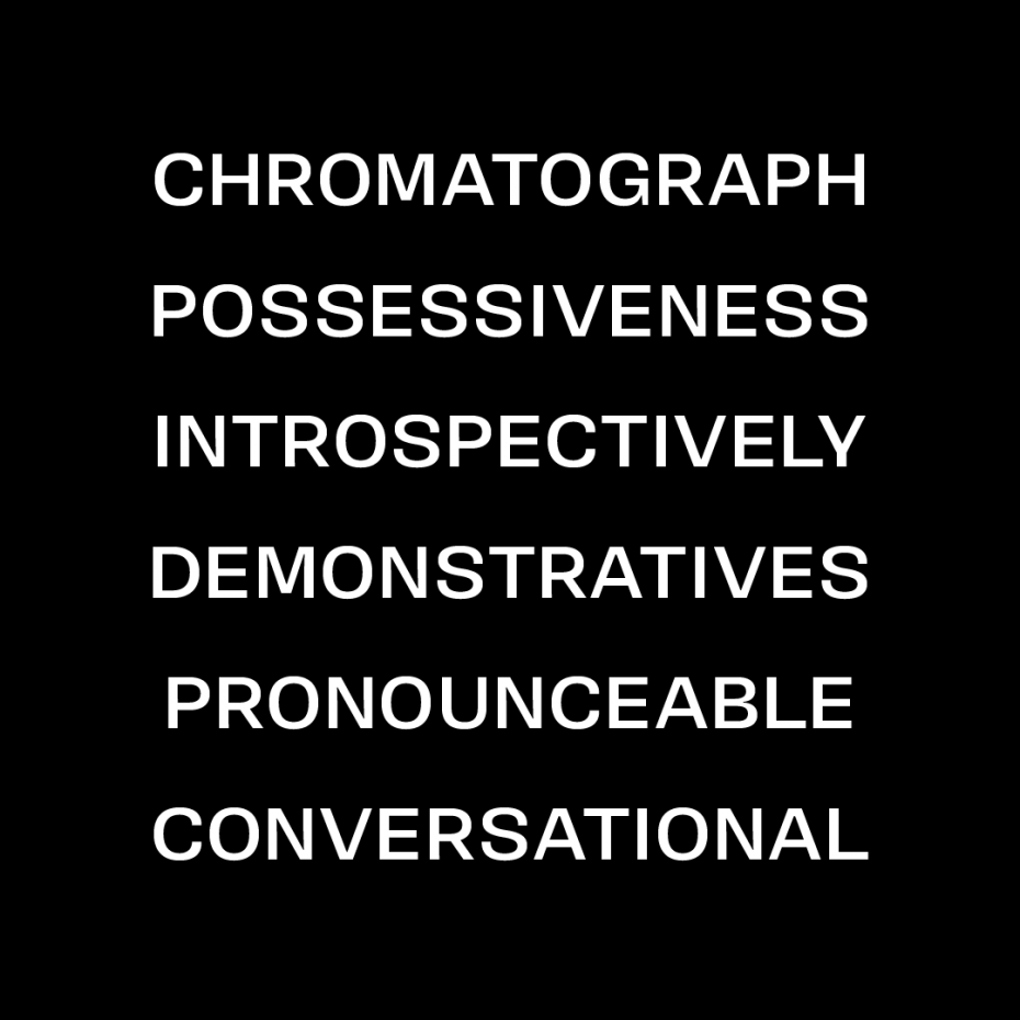
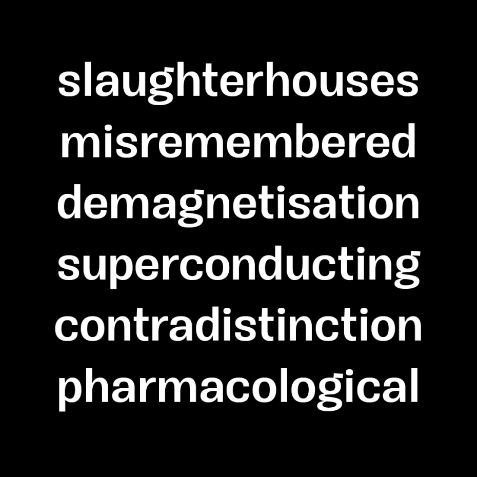
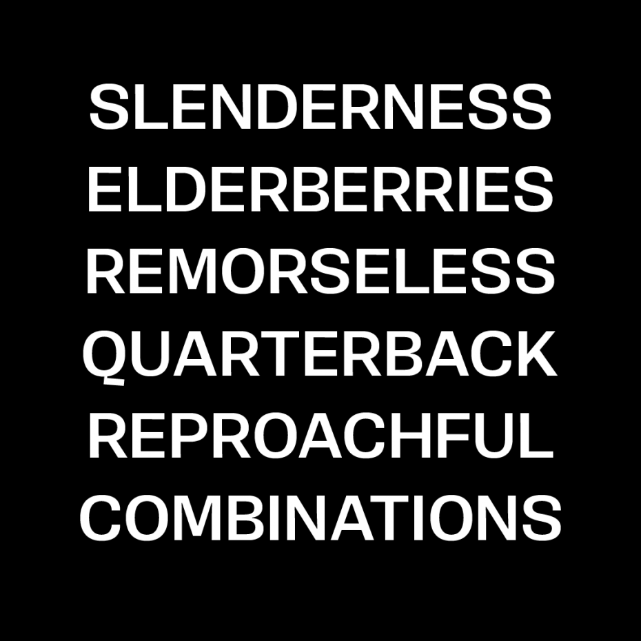
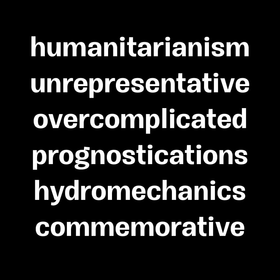
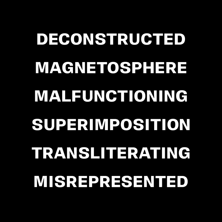
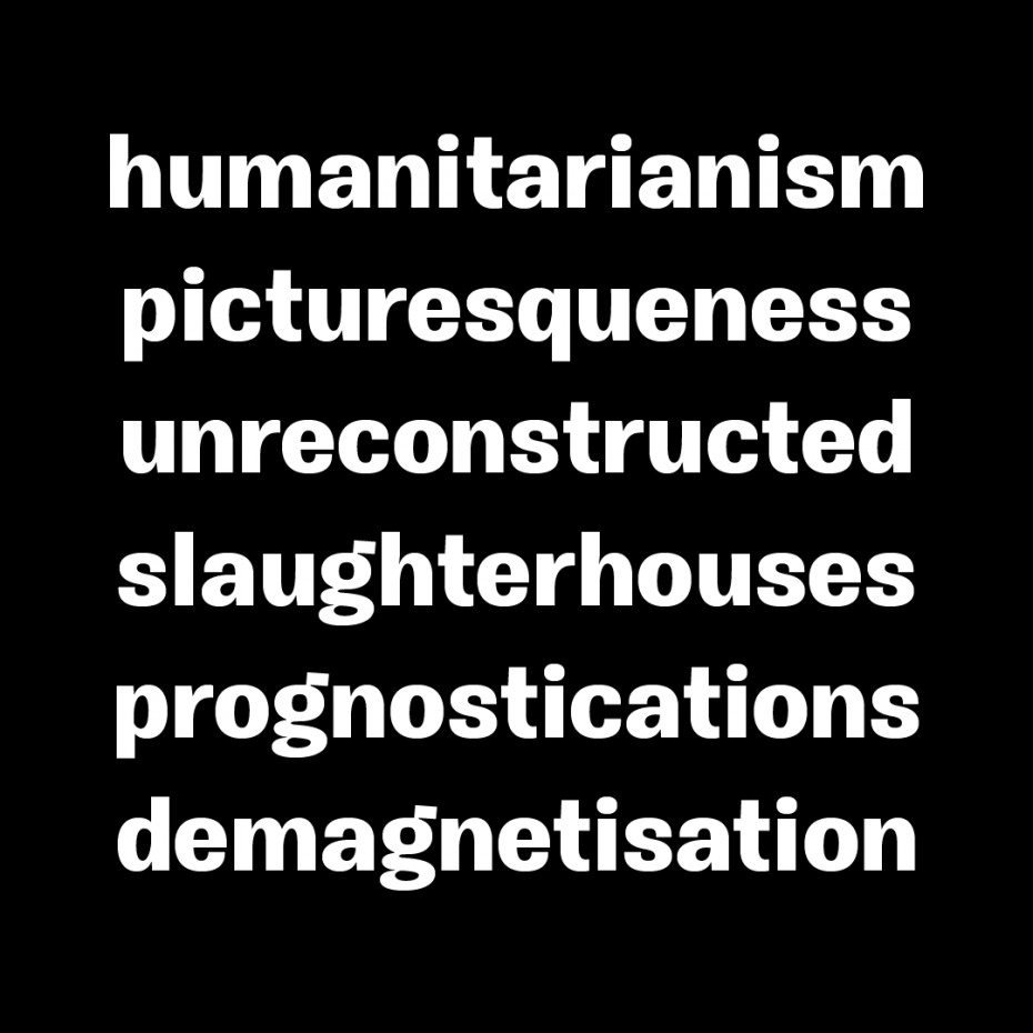
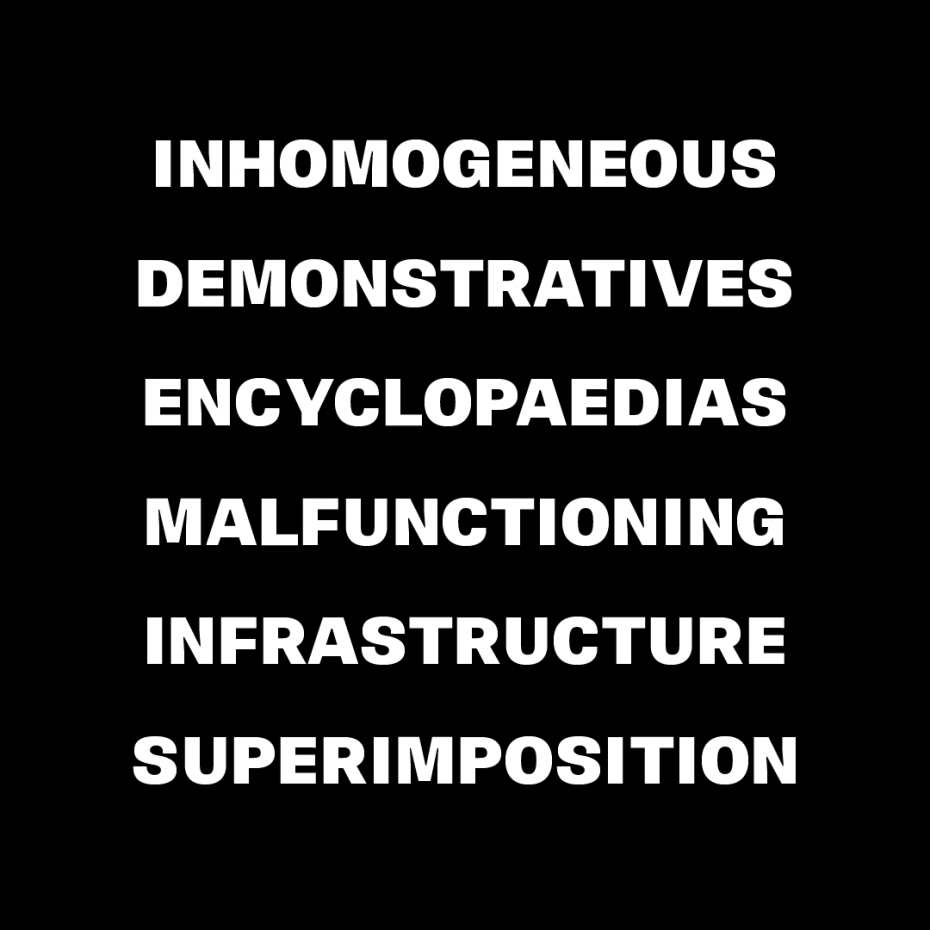
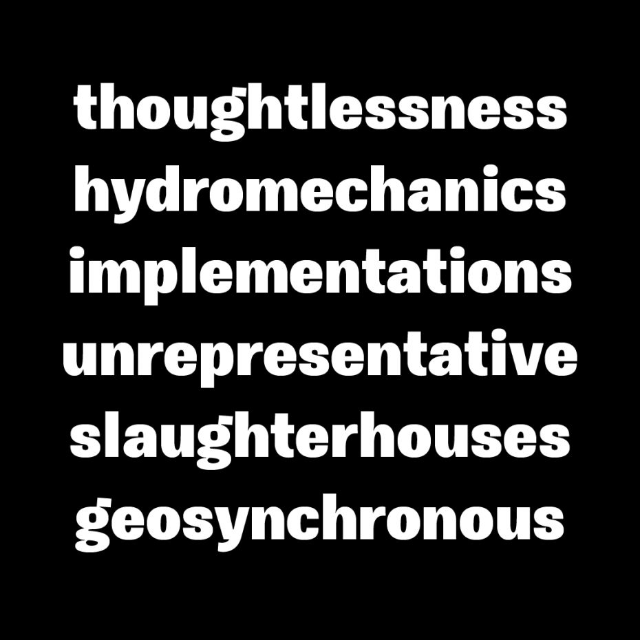
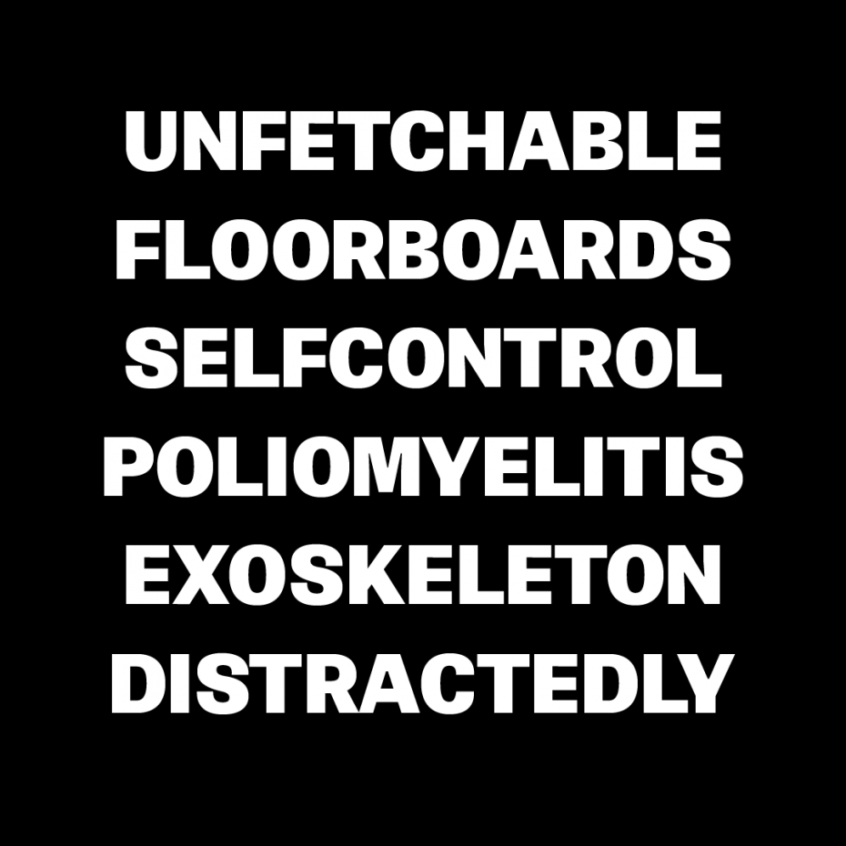
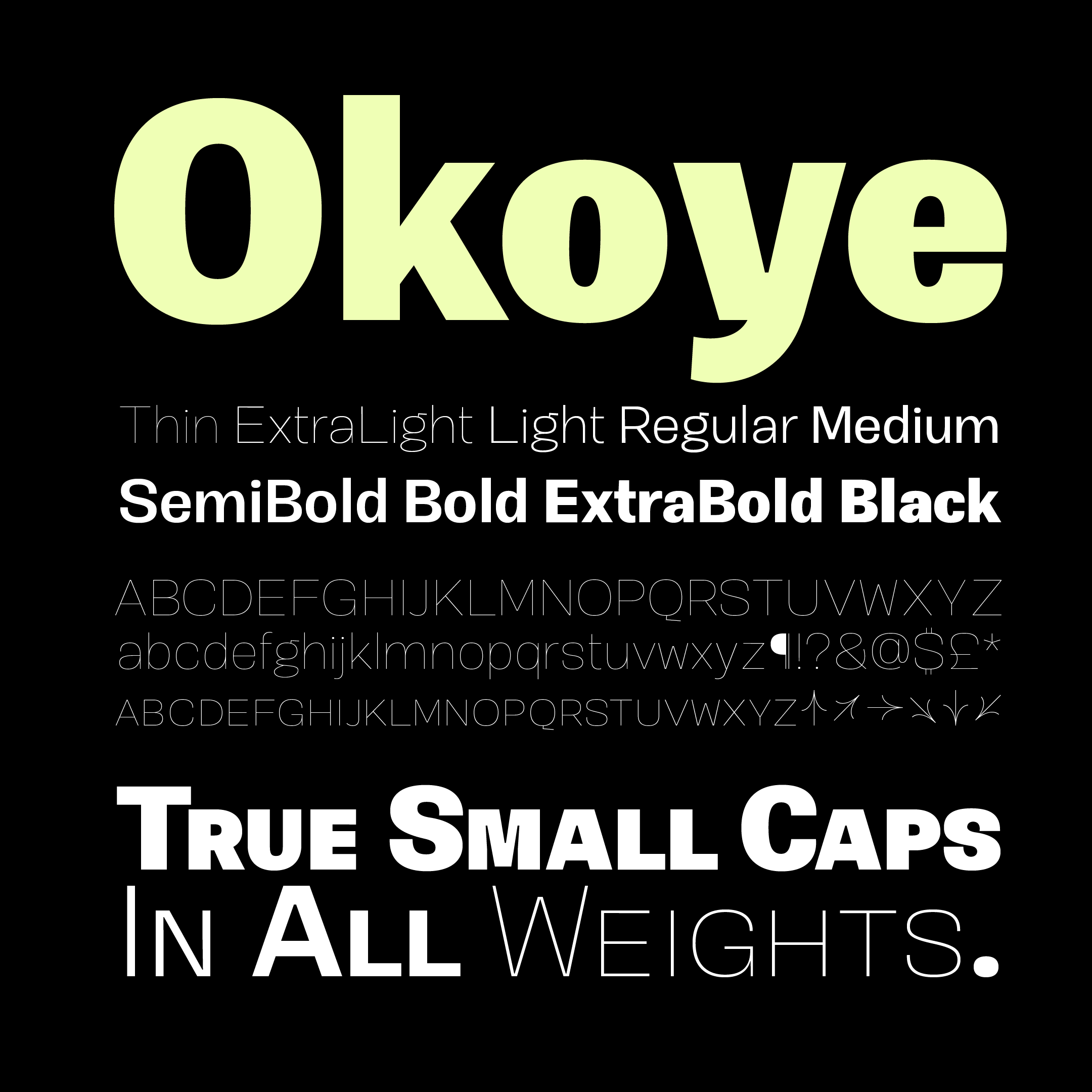
Okoye occupies a liminal space between the bonkers curviness of 19th-century grotesques and the sandblasted neutrality of 20th-century models. Both extremes are nice, but there’s something to be said for some neutrality with character left in place, yeah? Yeah! Okoye is warm in long texts with lowercase forms but stately in all-caps and small-caps settings.
TRY ME.

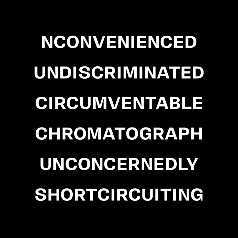
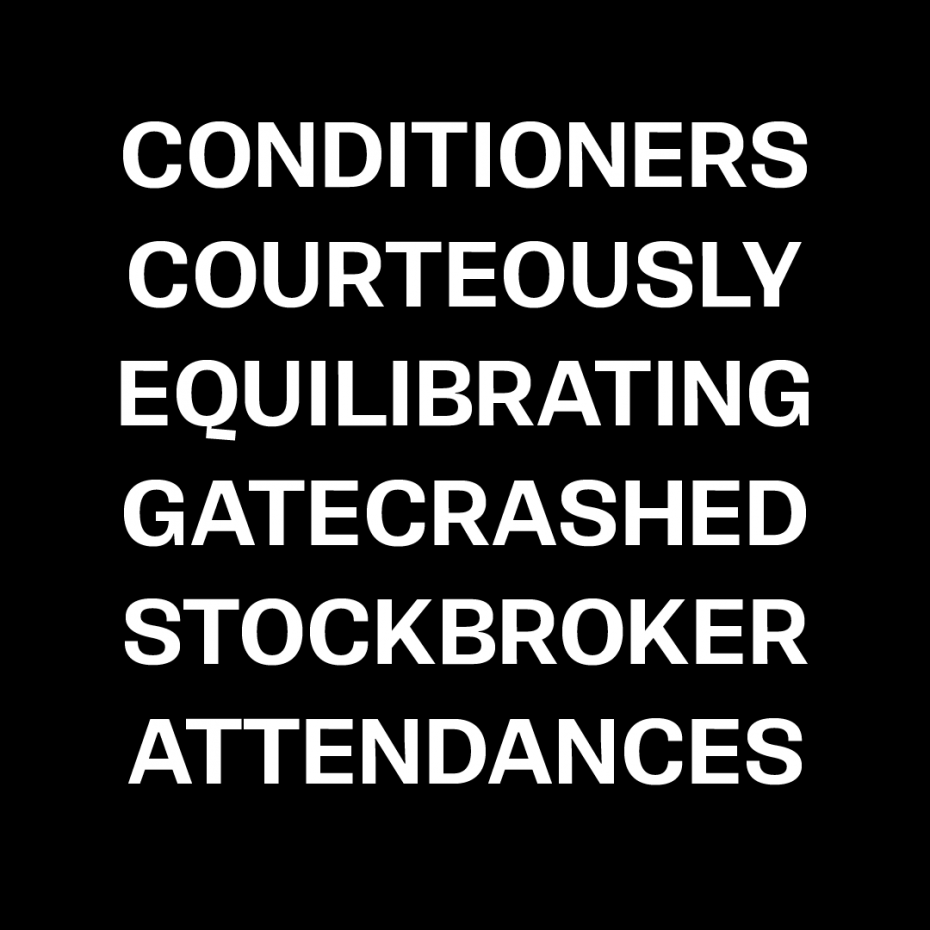
Okoye is warm in long texts with lowercase forms, but stately in all-caps and small-caps settings.
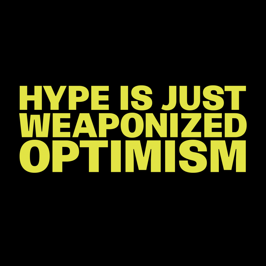
I spent a lot of time looking at the uppercase going, “does a Jenny Holzer-like text carry the right authority in this typeface?” That’s a hard thing to pull off! You want to see the idea, but not so much the typeface.
I think it works. I’d wear this on a t-shirt.
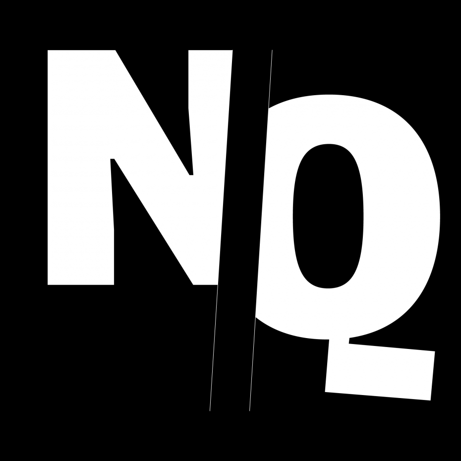
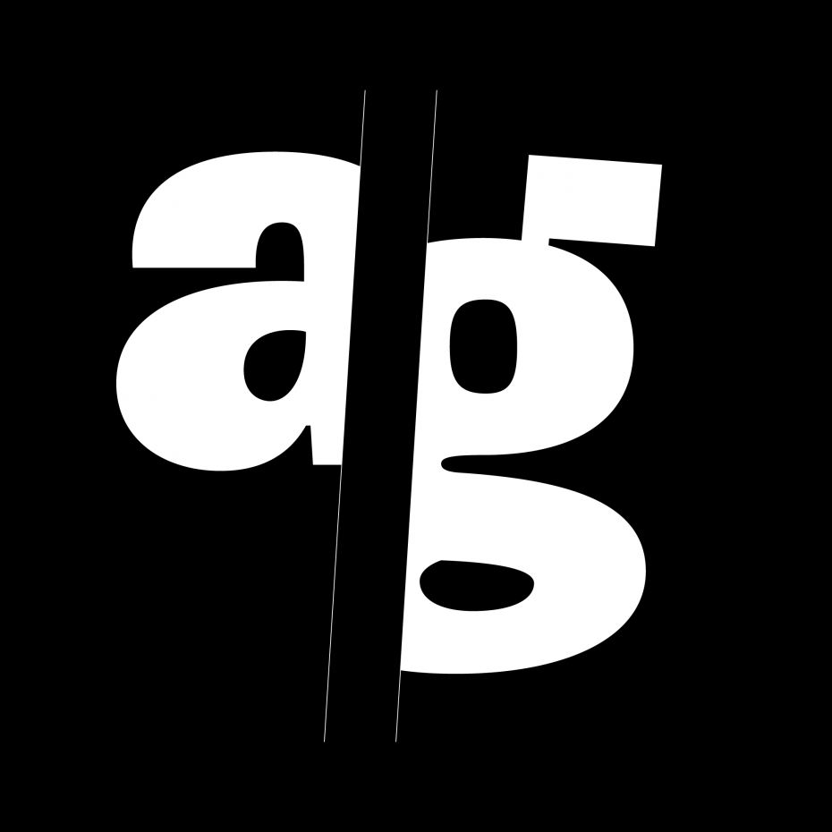
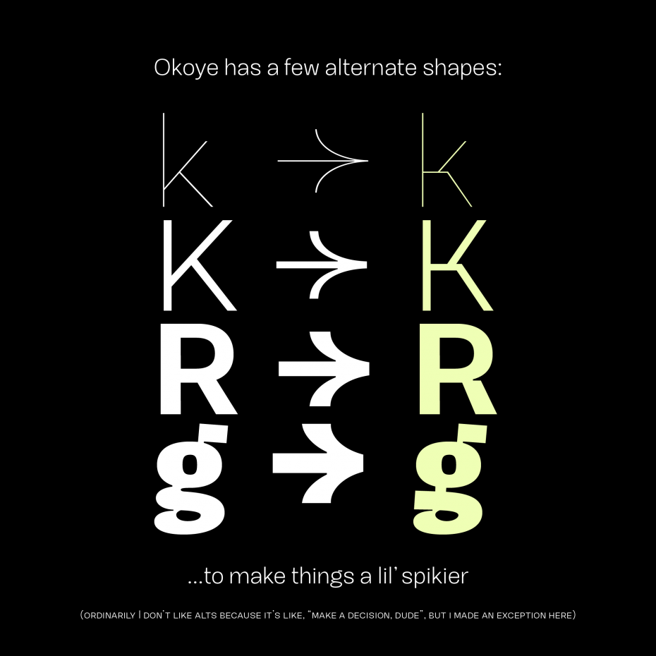
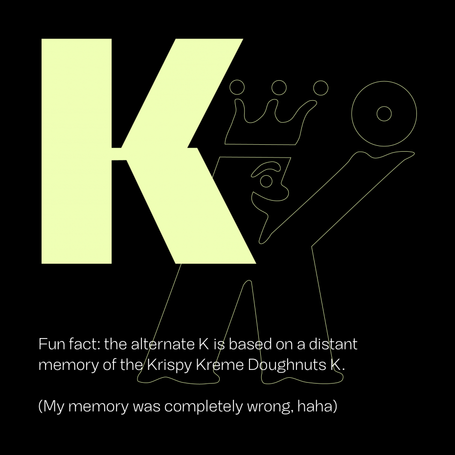
Bowls swoop into stems on b, d, p and q—that lends a sense of the handwritten. To counter that roundness, there’s a little jutting shape standing in for g’s ear and Q’s tail, a little angularity adding contrasting pattern. That’s echoed in stylistic alternates for K, R, g, and k—where lower horizontal strokes jut with the same energetic abruptness. (You can turn that extra energy on by choosing SS01 on your OpenType panel in Adobe Illustrator, or in OpenType options in InDesign.)
In all weights, there is motion: a slight overhang of the tops and squaring of the lower stroke.
That is to say: Okoye is a little bucktoothed.
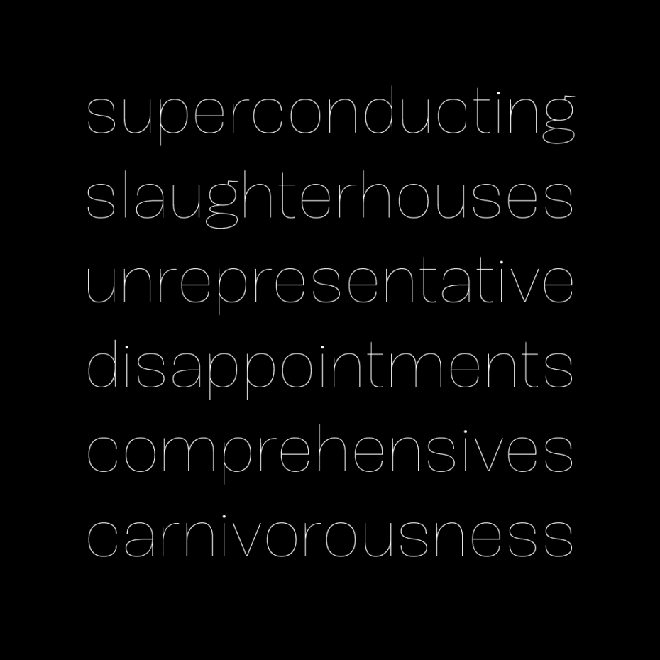
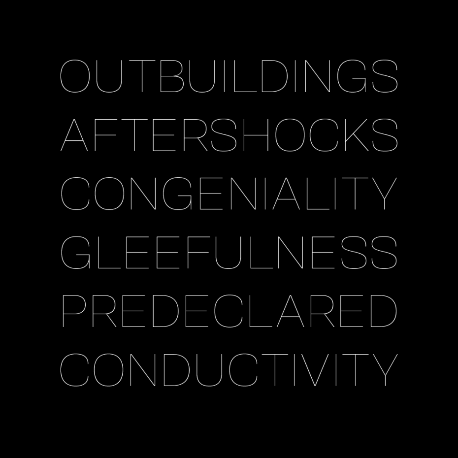
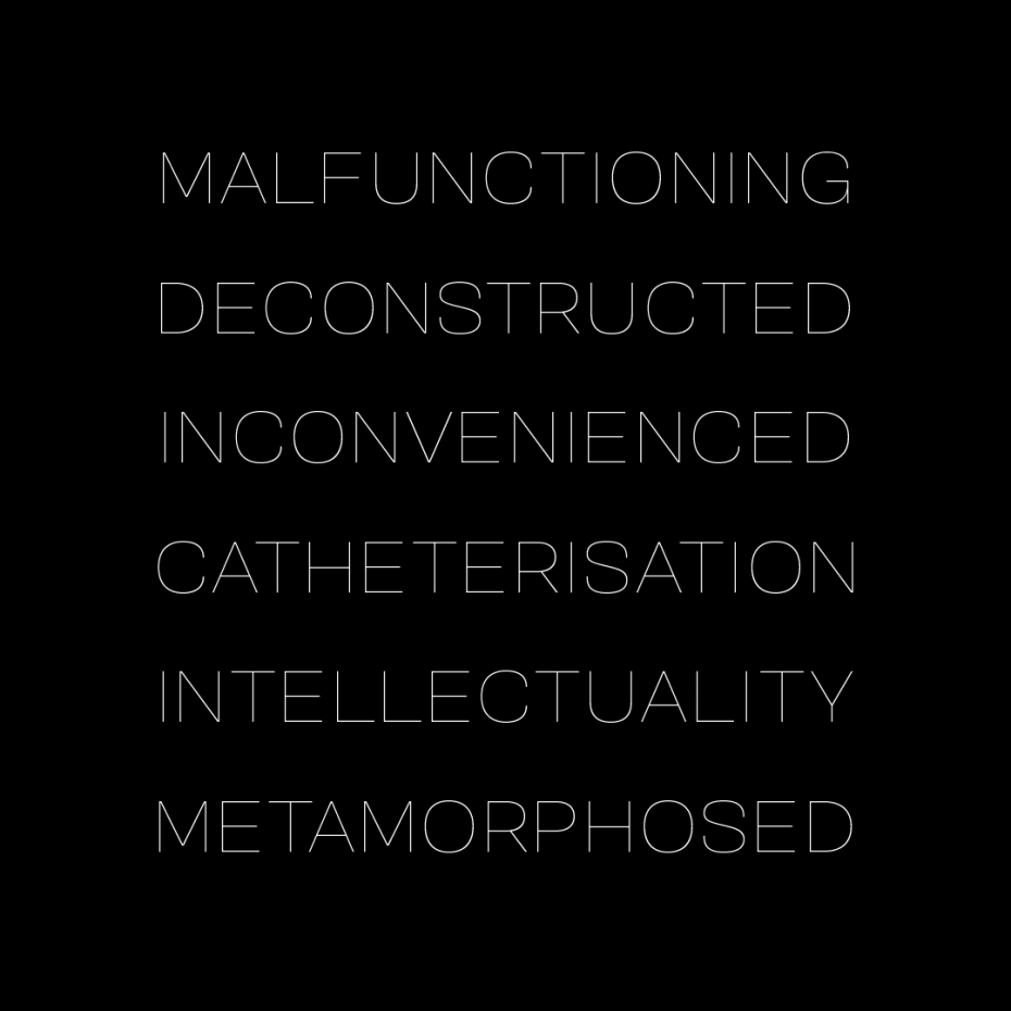
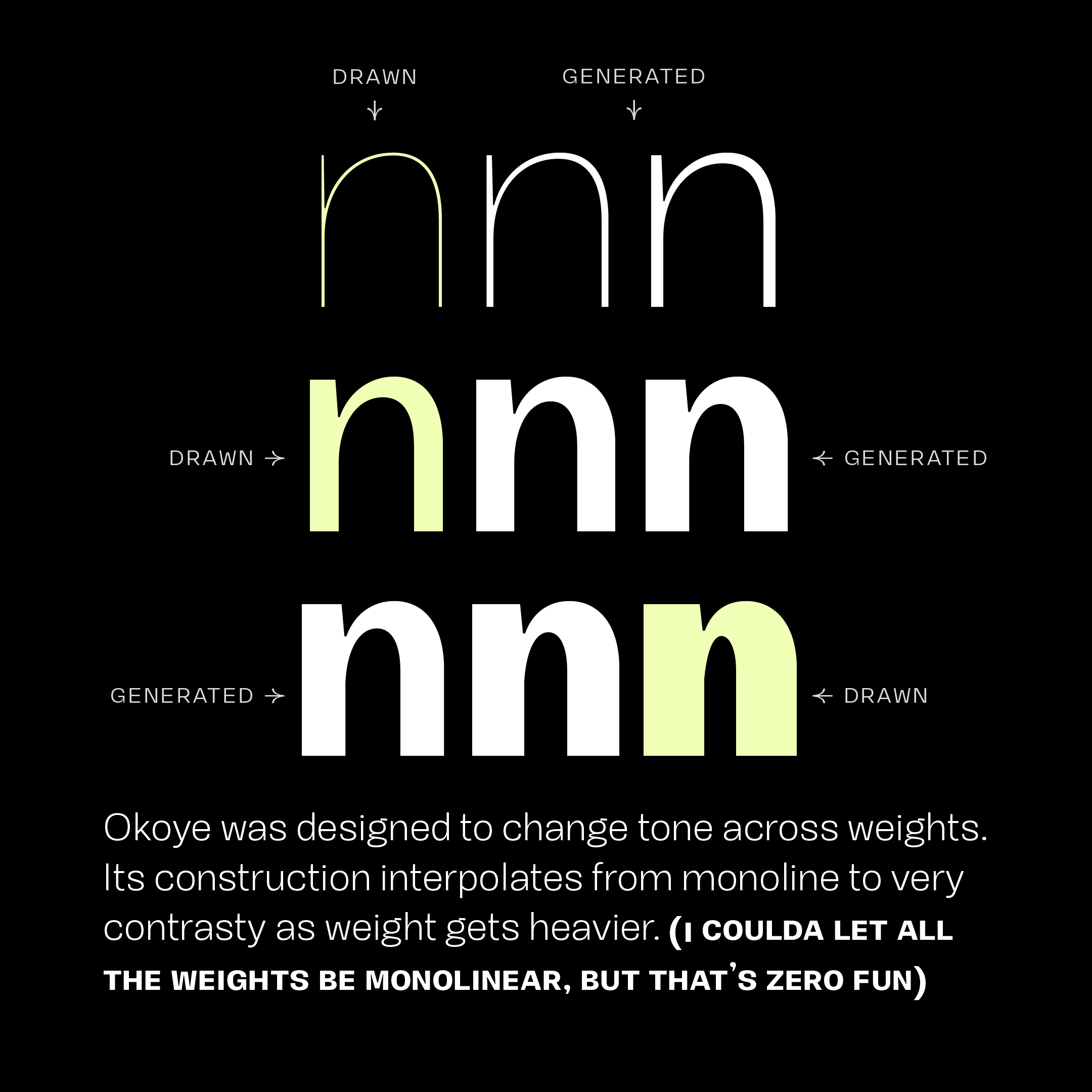
Okoye’s weights are interesting: Thin to Regular are almost totally monolinear. But Medium to Black get very contrasty. Spacing is also interesting: Thin to Regular are open and airy. Medium to Black closes spaces between letters, with Black being tight and imposing for great headlines. Counters completely change in form from lightest to heaviest weights. In light weights, the counters snake along the outer contours’ paths, then change form in heaviest weights to become a squared oval, giving verticals their contrast.
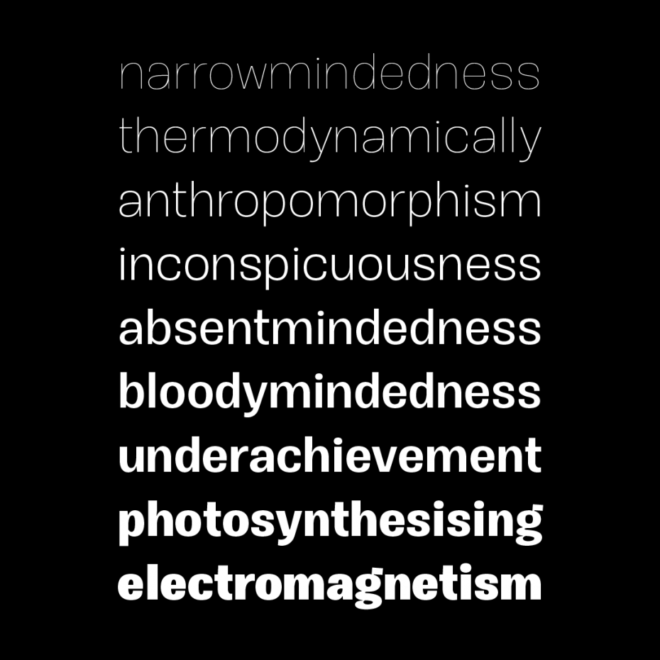
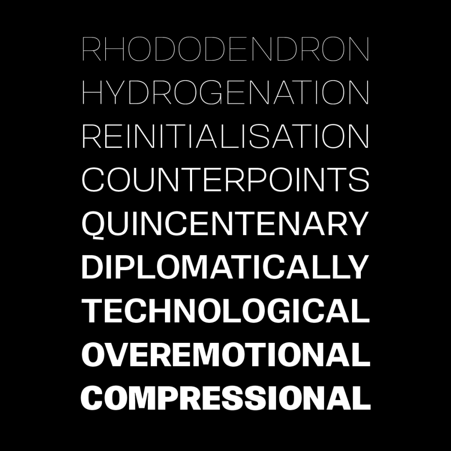
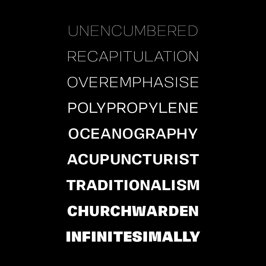
Okoye comes in 9 weights, Thin to Black. If you’re using it for interfaces, each weight lines up from 100-900 in the CSS specification you already know, with Regular sitting at 400, Bold at 700, and Black at 900. You’ll see what you expect to see without extra font-weight specification.
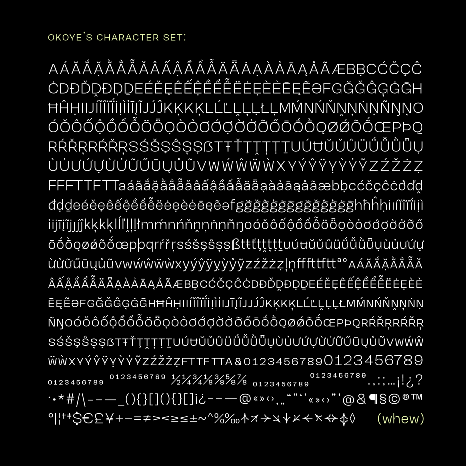
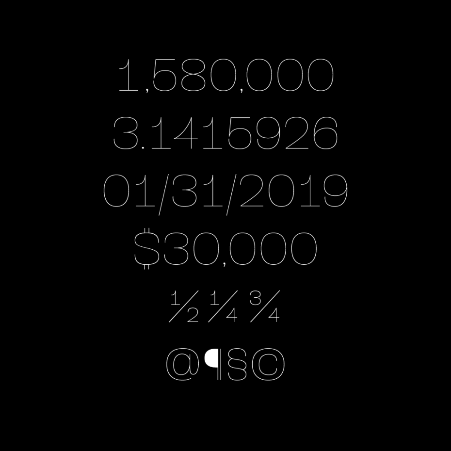
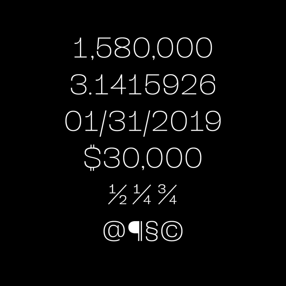
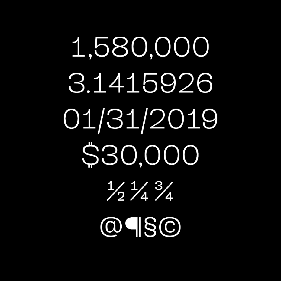
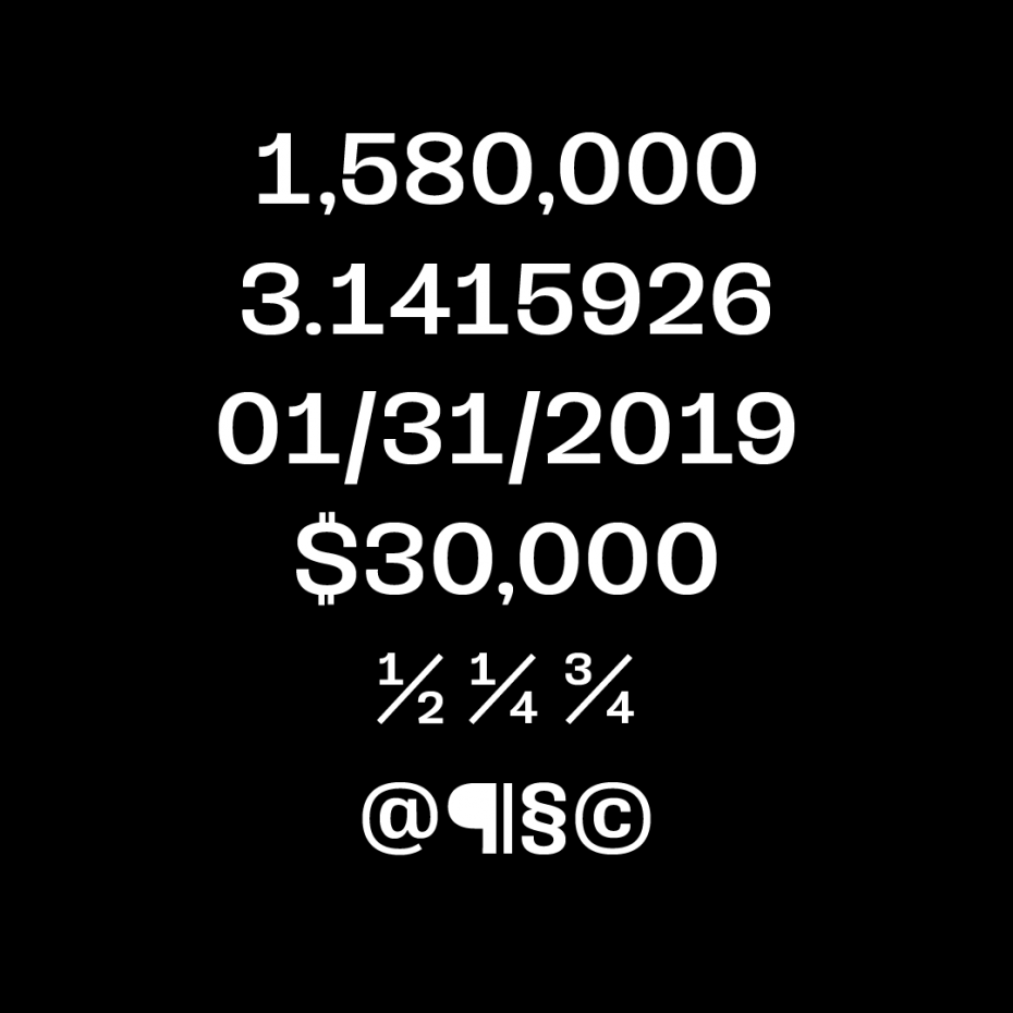
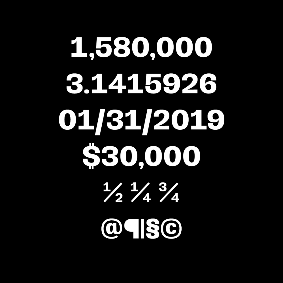
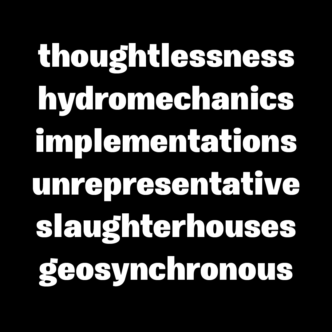
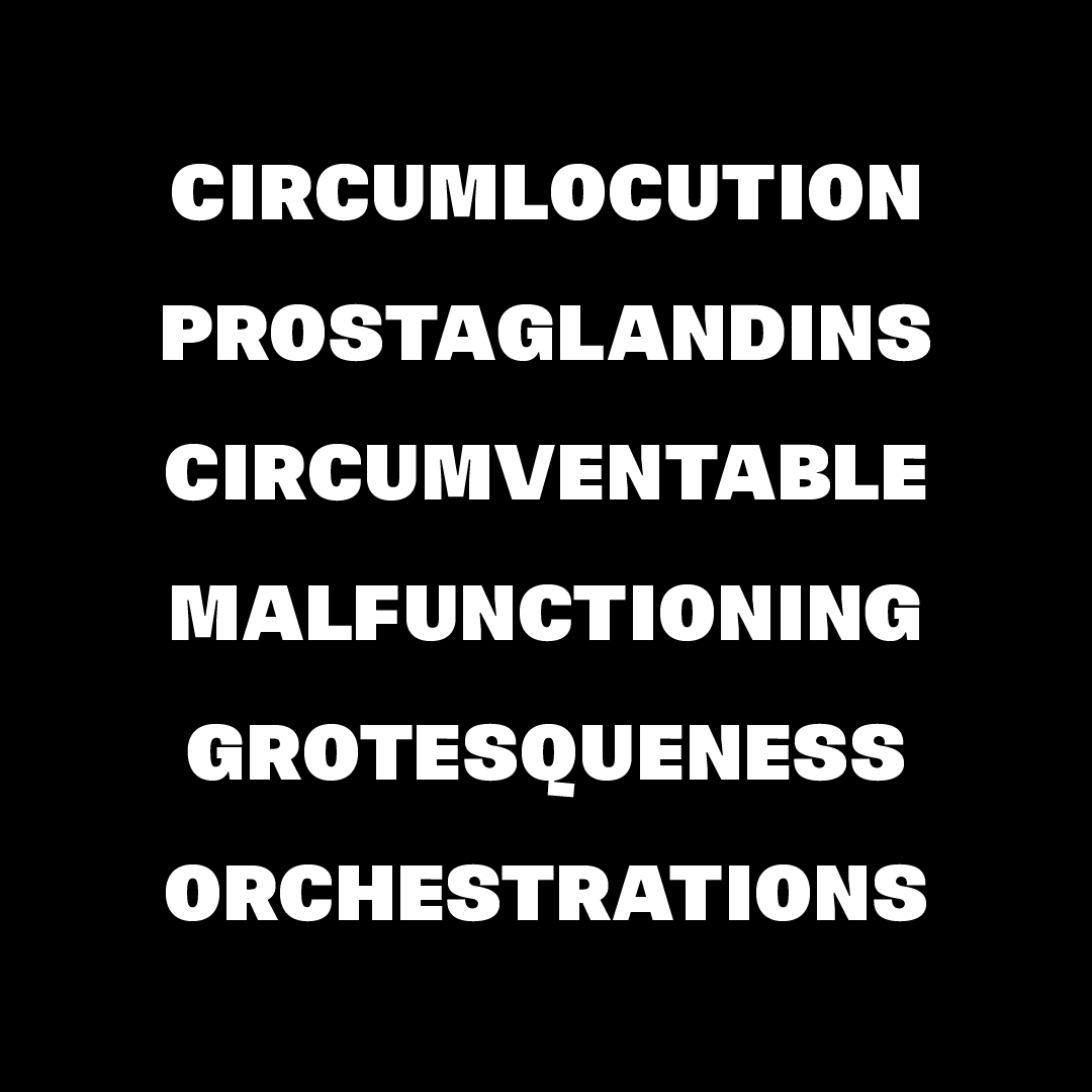
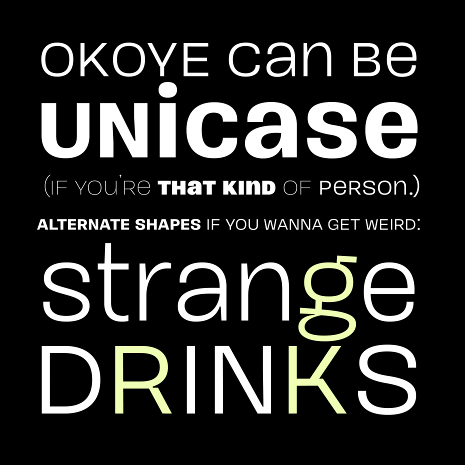
There’s extensive Latin language support, a set of small caps which mirrors full-size caps exactly (which works nicely for labels on controls), and arrows to point out important things in text or interface. Okoye will be your quirkhorse: hardworking, with personality.